Enviromeant
  • Wayfinding
  • Restaurants
  • Workplace
  • Signage
  • Exteriors
  • Interiors
888 Likes
637 Followers
2K Followers
Enviromeant
Enviromeant Enviromeant
  • Wayfinding
  • Restaurants
  • Workplace
  • Signage
  • Exteriors
  • Interiors
  • Signage
  • Wayfinding

The Cooper Union

  • October 28, 2010
  • Mariana
Total
0
Shares
0
0
0

The Cooper Union for the Advancement of Science and Art opened its new academic building on its Cooper Square campus in New York’s East Village. Designed by the Pritzker Prize-winning architect Thom Mayne of Morphosis, the building has quickly become one of the city’s new landmarks. Abbott Miller has designed a unique program of signage and environmental graphics for the building that is fully integrated with the building’s dynamic architecture.

Miller is a Cooper alumnus—this year he received the school’s prestigious Augustus Saint-Gaudens Award—and he knew the campus well. The new academic building, located at 41 Cooper Square, sits directly across Third Avenue from the Cooper Union’s original 1859 building, called the Foundation building. Like Mayne’s architectural design, Miller’s graphics for the new building establish a dialogue with the older structure.

The Cooper Union. Designed by Pentagram / @enviromeant.com

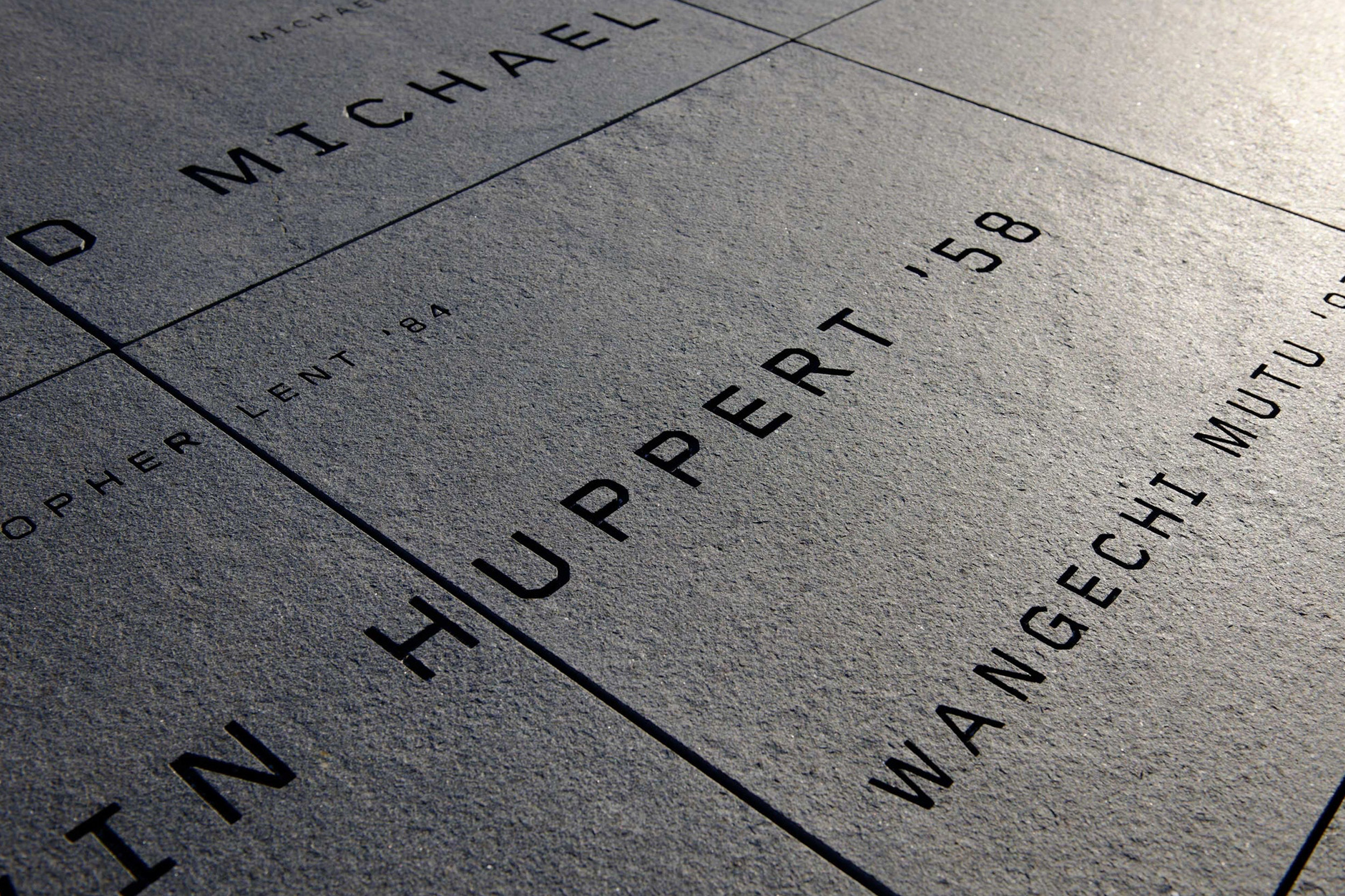
The environmental graphics were also inspired by some of Miller’s typographic explorations in his book Dimensional Typography. The signage typography has been physicalized in different ways, engaging multiple surfaces of the three-dimensional signs, appearing extruded across corners, or cut, extended and dragged through the material. Miller worked closely with Morphosis to integrate the signage into the building. The building canopy features optically extruded lettering that appears “correct” when seen in strict elevation, but distorts as the profile of the letter is dragged backwards in space. The cutouts in the lower half of the letterforms echo the transparency of the building’s surface “skin” of perforated stainless steel.

The Cooper Union. Designed by Pentagram / @enviromeant.com

Text and photos copyright of Pentagram.com

Total
0
Shares
Share 0
Tweet 0
Pin it 0
Related Topics
  • Abbott Miller
  • East Village
  • education
  • environmental graphics
  • morphosis
  • new york
  • ny
  • pentagram
  • signage
  • The Cooper Union
  • typography
  • wayfinding
Mariana

Mariana Pacheco is a visual designer, founder of Design Etiquette. She specializes in branding and web design. She loves Environmental Graphics Design as well.

Previous Article
  • Stores

Cass Art New York

  • October 19, 2010
  • Mariana
View Post
Next Article
  • Education
  • Interiors
  • Signage

Achievement First

  • October 28, 2010
  • Mariana
View Post
You May Also Like
View Post
  • Exteriors
  • Featured
  • Signage
  • Wayfinding

Dublin Docklands

  • Mariana
  • December 27, 2020
View Post
  • Featured
  • Signage
  • Workplace

Objective Paradigm

  • Mariana
  • October 23, 2020
View Post
  • Featured
  • Interiors
  • Signage
  • Wayfinding

Sina Plaza

  • Mariana
  • April 12, 2019
View Post
  • Interiors
  • Signage
  • Wayfinding

Primus Hotel Sydney

  • Mariana
  • February 13, 2019
View Post
  • Placemaking
  • Signage
  • Wayfinding

Drakes Foodland Wayville

  • Mariana
  • November 26, 2018
View Post
  • Museums
  • Signage

Migration Museum

  • Mariana
  • October 3, 2018
View Post
  • Education
  • Interiors
  • Wayfinding

Nubo

  • Mariana
  • June 14, 2018
View Post
  • Exteriors
  • Wayfinding

The Goods Line

  • Mariana
  • May 30, 2018

Leave a Reply Cancel reply

Your email address will not be published. Required fields are marked *

Wayfinding
Workplace
Restaurants
    • Exteriors
    • Featured
    • Signage
    • Wayfinding

    Dublin Docklands

      • Exteriors
      • Featured
      • Signage
      • Wayfinding
    View Post
    • Exteriors
    • Featured
    • Restaurants

    UHill Walls

      • Exteriors
      • Featured
      • Restaurants
    View Post
    • Featured
    • Interiors
    • Placemaking
    • Workplace

    Undisclosed Tech Client

      • Featured
      • Interiors
      • Placemaking
      • Workplace
    View Post
Instagram
@joannebyrne.hello designed this signage system for Dublin’s Docklands. The signage highlights six sites of interest along the Dublin Docklands section of the River Liffey. Illustrations accompany the description of each place of interest, most of which can be seen from the location of the panel. The title is fret cut from powder-coated metal and the design is screen printed.
Beautiful signage system designed by @joannebyrne.hello for Dublin’s Docklands.⠀
@joannebyrne.hello designed this signage system for Dublin’s Docklands. The signage highlights six sites of interest along the Dublin Docklands section of the River Liffey. Illustrations accompany the description of each place of interest, most of which can be seen from the location of the panel. The title is fret cut from powder-coated metal and the design is screen printed.
Who doesn't love a life-size Scrabble? By @dlr_group 😍⠀
Textural typography for Li Ka Shing Library, part of Singapore Management University (SMU), created by @there_design⠀⠀
Incredible mural and space @WeWork Rio Claro 241.⠀
Follow
Follow Us
888
637
2K
302
Trending Posts
  • 1
    • Exteriors
    • Featured
    • Signage
    • Wayfinding
    Dublin Docklands
  • 2
    • Exteriors
    • Featured
    • Restaurants
    UHill Walls
  • 3
    • Featured
    • Interiors
    • Placemaking
    • Workplace
    Undisclosed Tech Client
  • 4
    • Featured
    • Signage
    • Workplace
    Objective Paradigm
  • 5
    • Exteriors
    • Featured
    Bright Walls

Subscribe

Subscribe now to our newsletter

@joannebyrne.hello designed this signage system for Dublin’s Docklands. The signage highlights six sites of interest along the Dublin Docklands section of the River Liffey. Illustrations accompany the description of each place of interest, most of which can be seen from the location of the panel. The title is fret cut from powder-coated metal and the design is screen printed.
Beautiful signage system designed by @joannebyrne.hello for Dublin’s Docklands.⠀
@joannebyrne.hello designed this signage system for Dublin’s Docklands. The signage highlights six sites of interest along the Dublin Docklands section of the River Liffey. Illustrations accompany the description of each place of interest, most of which can be seen from the location of the panel. The title is fret cut from powder-coated metal and the design is screen printed.
Who doesn't love a life-size Scrabble? By @dlr_group 😍⠀
Textural typography for Li Ka Shing Library, part of Singapore Management University (SMU), created by @there_design⠀⠀
Incredible mural and space @WeWork Rio Claro 241.⠀

The boundaries of design continue to blur, different disciplines start to merge, and the visualization of brand identity and communication start to widen.

Environmental graphic design is a discipline that merges architecture, interior, & graphic design in order to produce an integrated brand identity, create clear signage systems, and produce interactive and exciting environments.

Enviromeant is a showcase of the best and most interesting projects in the field of EGD.

  • Wayfinding
  • Restaurants
  • Workplace
  • Signage
  • Exteriors
  • Interiors

At Enviromeant we are always looking for interesting projects which accomplish to combine architecture, interior and graphic design. If you want to showcase your work, just send us an mail to submit@enviromeant.com with the images (Minimum 1800px wide) and a description of your project. We’ll be happy to review it for submission.

Enviromeant
A blog about Environmental Graphic Design, Signage & Wayfinding Systems.

Input your search keywords and press Enter.