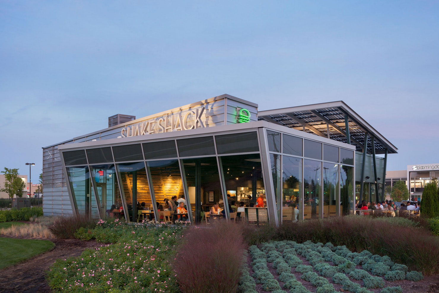
As every Shackburger fan knows, Shake Shack serves some of the best burgers in the world. And now, with a recent IPO that has valued the company at a staggering $1.6 billion, more of the world will get to know the Shack: from its roots as a hot dog stand in New York’s Madison Square Park, the company has grown into a chain of 63 restaurants from Chicago to Dubai, and plans to use the additional funds to expand to over 400 locations in the next decade.
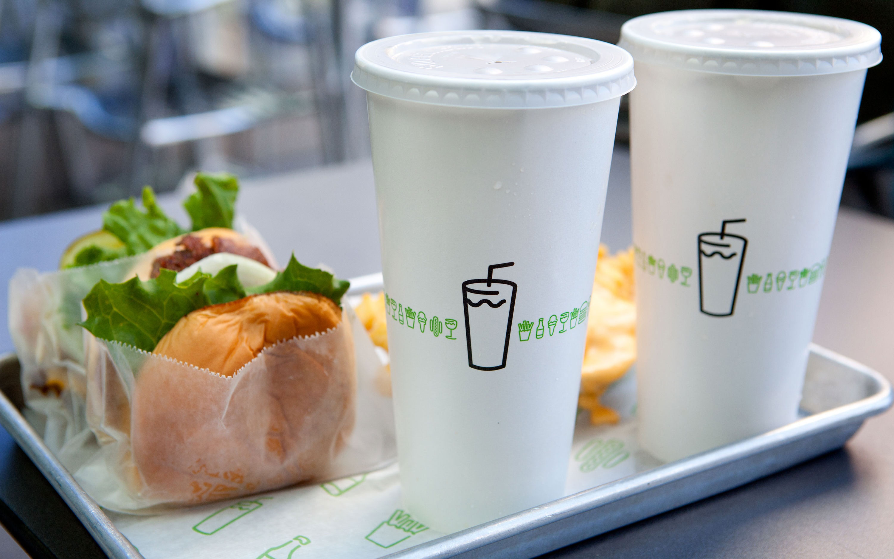
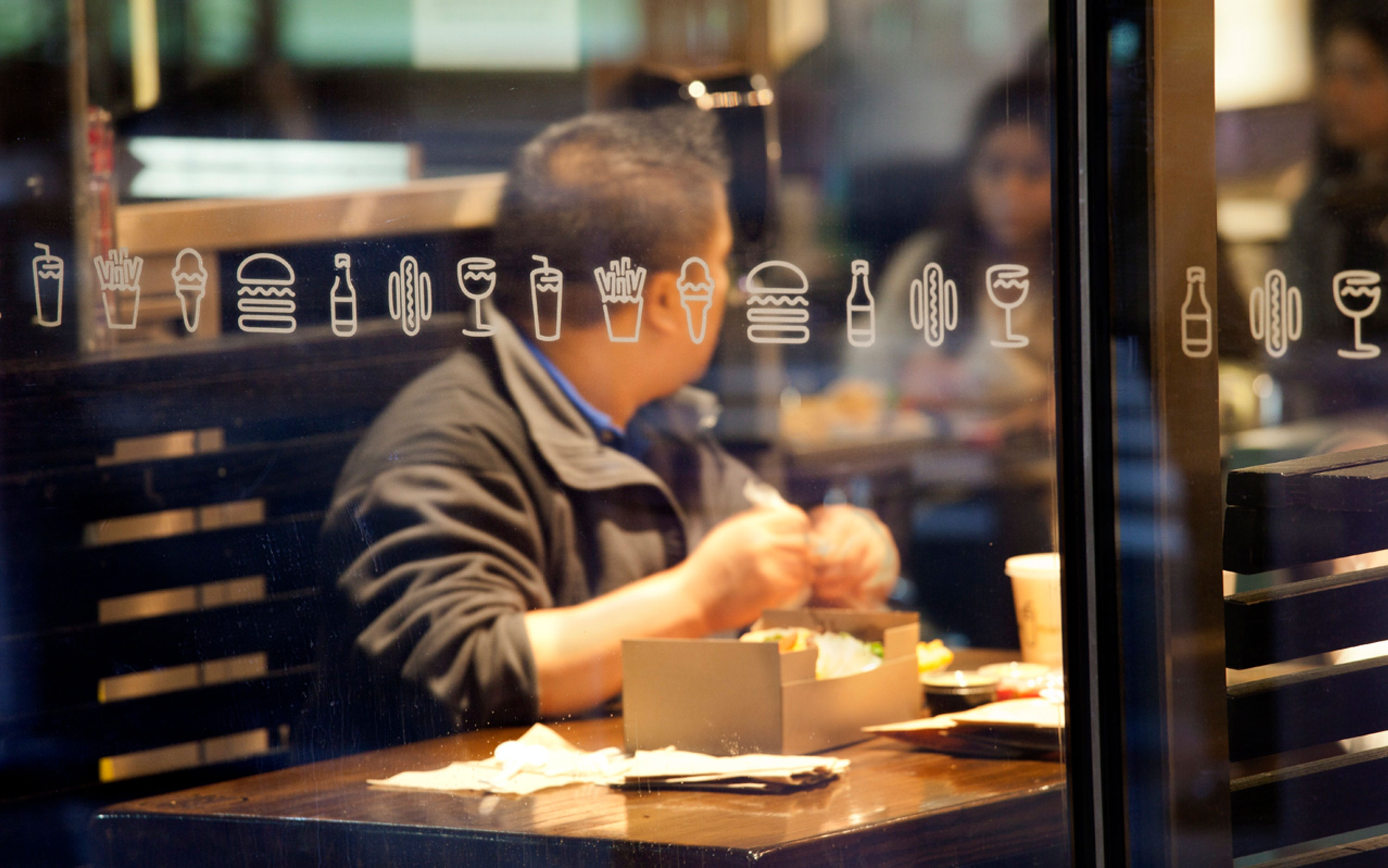
Tastiness of its burgers aside, no small part of Shake Shack’s success is due to its sophisticated sense of design, expressed in an iconic brand identity and environmental graphics by Pentagram and original restaurant architecture by James Wines and his firm SITE. (Shake Shack even noted its fantastic brand awareness as an asset in IPO prospectus.)
Like the High Line—another project with an identity by Pentagram—Shake Shack started as a relatively small local initiative that blossomed into an globally recognized brand. The first Shack was conceived as an installation to help support the refurbishment of Madison Square Park. Beginning in 1999, the Madison Square Park Conservancy led a major effort, supported by local businesses and public funds, to restore the park to its 19th-century luster. The park is located across the street from Pentagram’s New York offices.
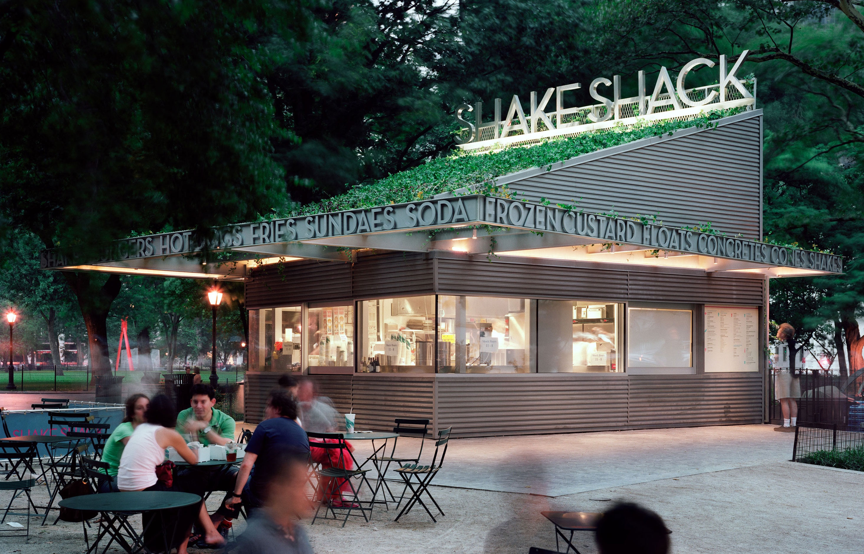
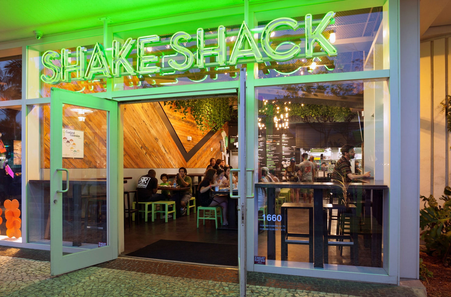
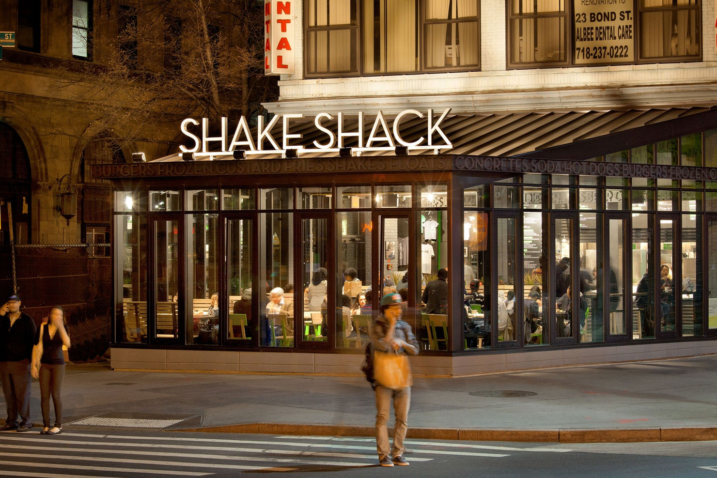
Pentagram’s graphics for the original kiosk displayed a visual sophistication appropriate to the area, which unofficially might be called New York’s design district, given its concentration of studios and firms. The signage combined the aesthetics of the area’s art deco “23 Skidoo” heyday with the direct appeal of the typical fast food stand. The signage typography was designed to look playfully heroic in terms of scale: “Shake Shack” was rendered in Coney Island-sized letters across the roof, but in elegant and modern stainless steel. Set in Neutraface, this initial logo still appears as exterior signage on all the Shacks around the world.
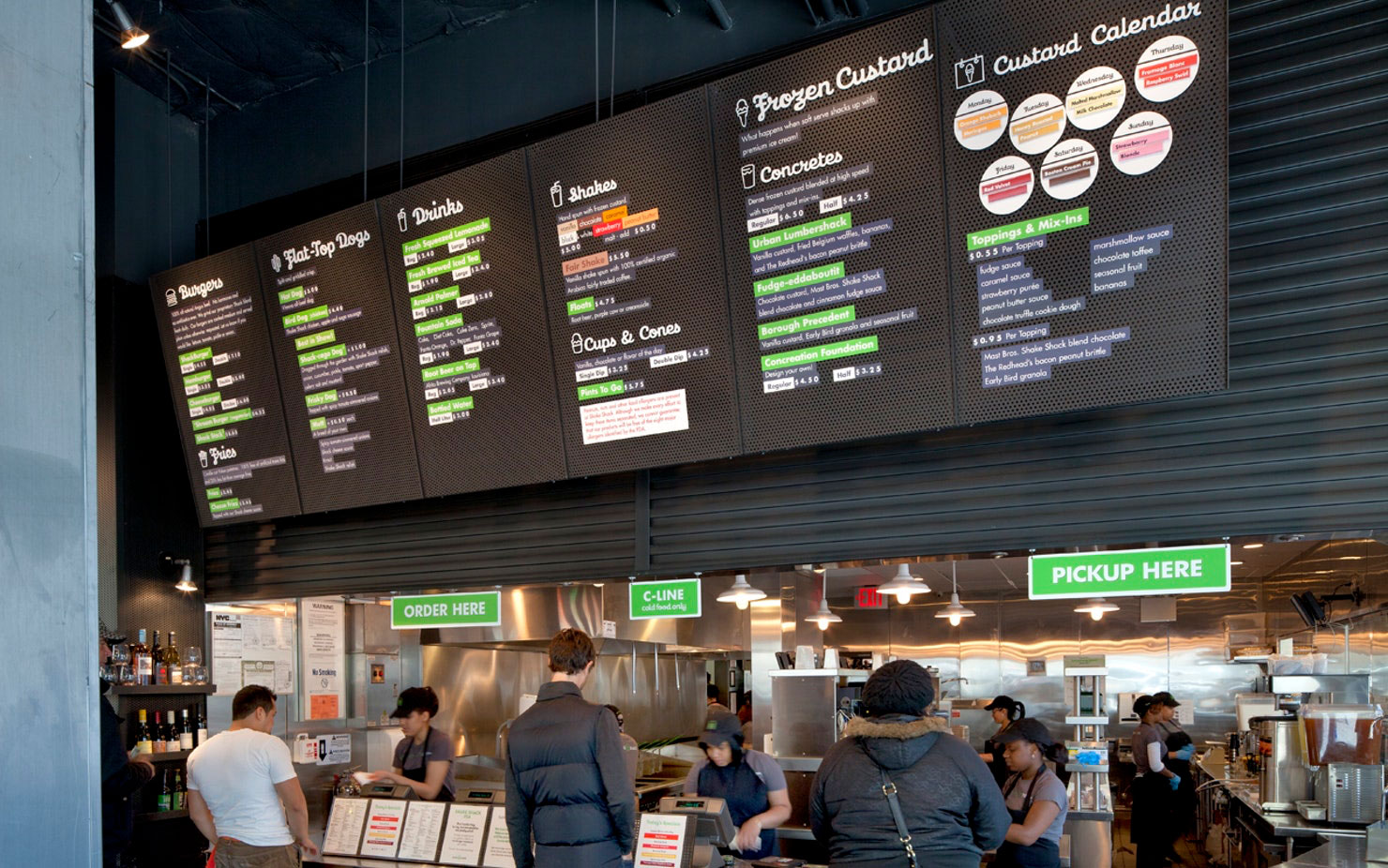
A smaller typographic relief running around the rim of the trellis listed menu mainstays like shakes and burgers; the letters were pin-mounted for the illusion of depth. “The food items list cantilevered over the park space in the form of an I-beam sculpture—or more specifically, the ‘menu as the building,’” says Wines. “The perforated zinc façade material was intended to reflect the color and rib-like surfaces of the Flatiron Building.” These elements have been carried over to all the Shacks.
Photography copyright of Pentagram.com


