The $22 billion revitalization of Boston’s Seaport district is the largest active development project in the city’s history, transforming 33 acres of the formerly industrial waterfront into a dynamic mixed-use neighborhood. In the heart of Seaport is Harbor Way, a new pedestrian-focused promenade and park that is lined with public spaces, stores and restaurants. Pentagram has designed a visual identity and program of signage for Harbor Way that gives it a distinctive presence within the district and connects it to the history of the area.
The Pentagram team worked closely on the project with WS Development and landscape architects James Corner Field Operations, with whom Pentagram previously collaborated on the High Line in New York and Nicollet Mall in Minneapolis. The design of the new Boston promenade is inspired by the Harbor itself, incorporating elements of New England’s coastal geology, forest landscapes and traditional weathered wooden boardwalks.
“We believe good wayfinding adds meaning and value to the Seaport district,” says Amy Prange, Vice President of Development, Seaport at WS. “The system that Pentagram developed has helped to create a sense of place and provides a refined, memorable and comfortable experience that connects visitors to retail, public spaces, and amenities in an intuitive manner.”
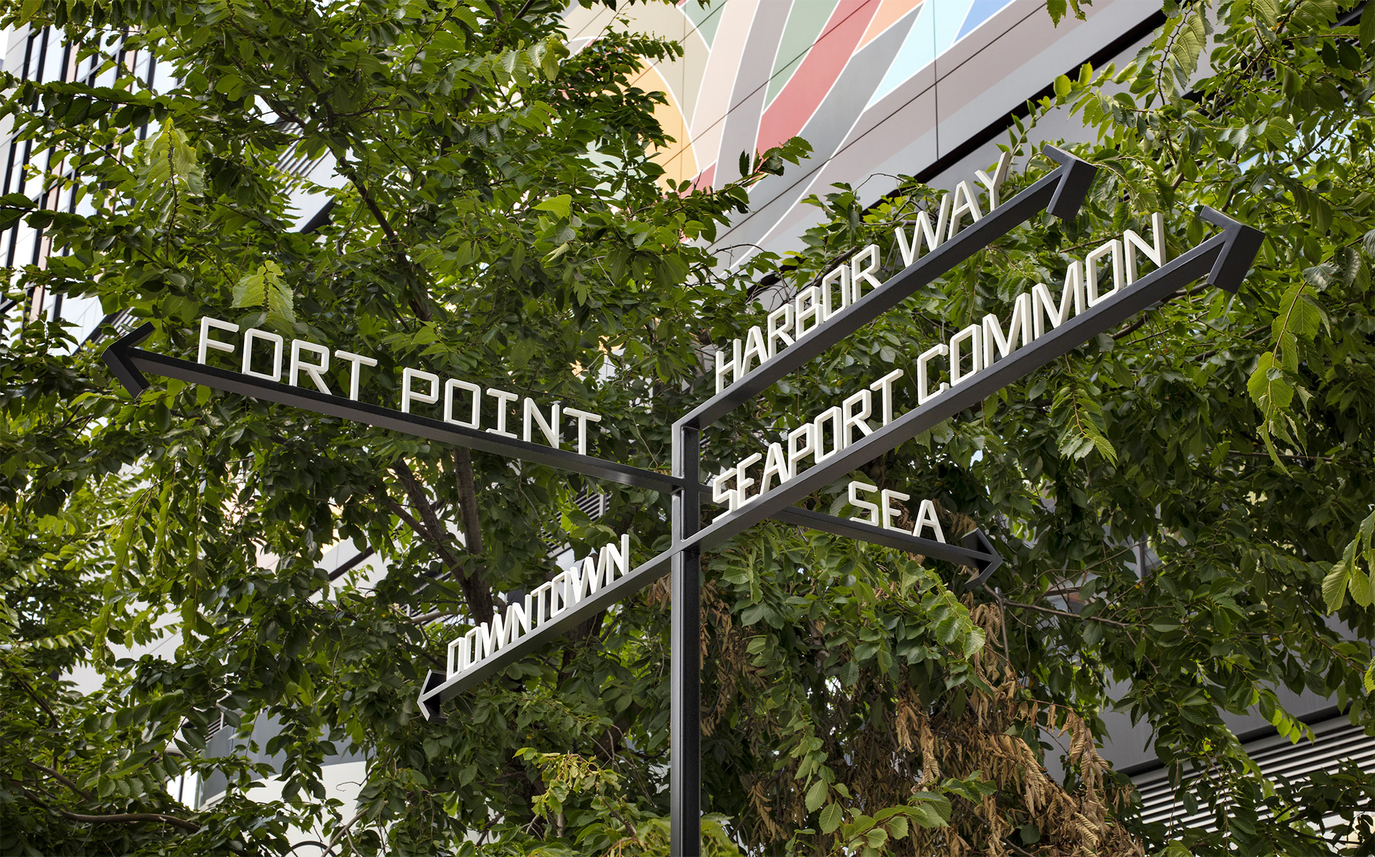
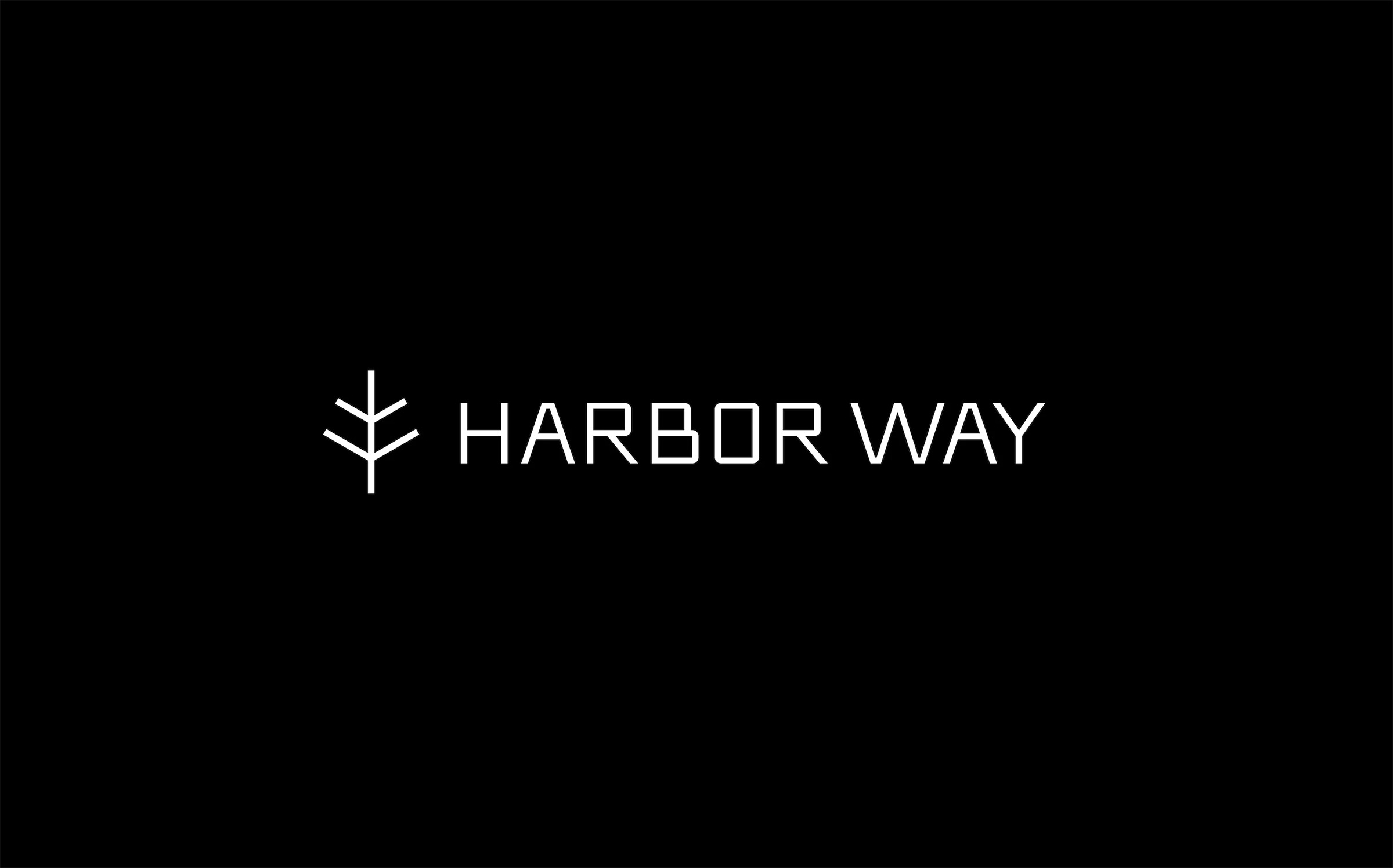
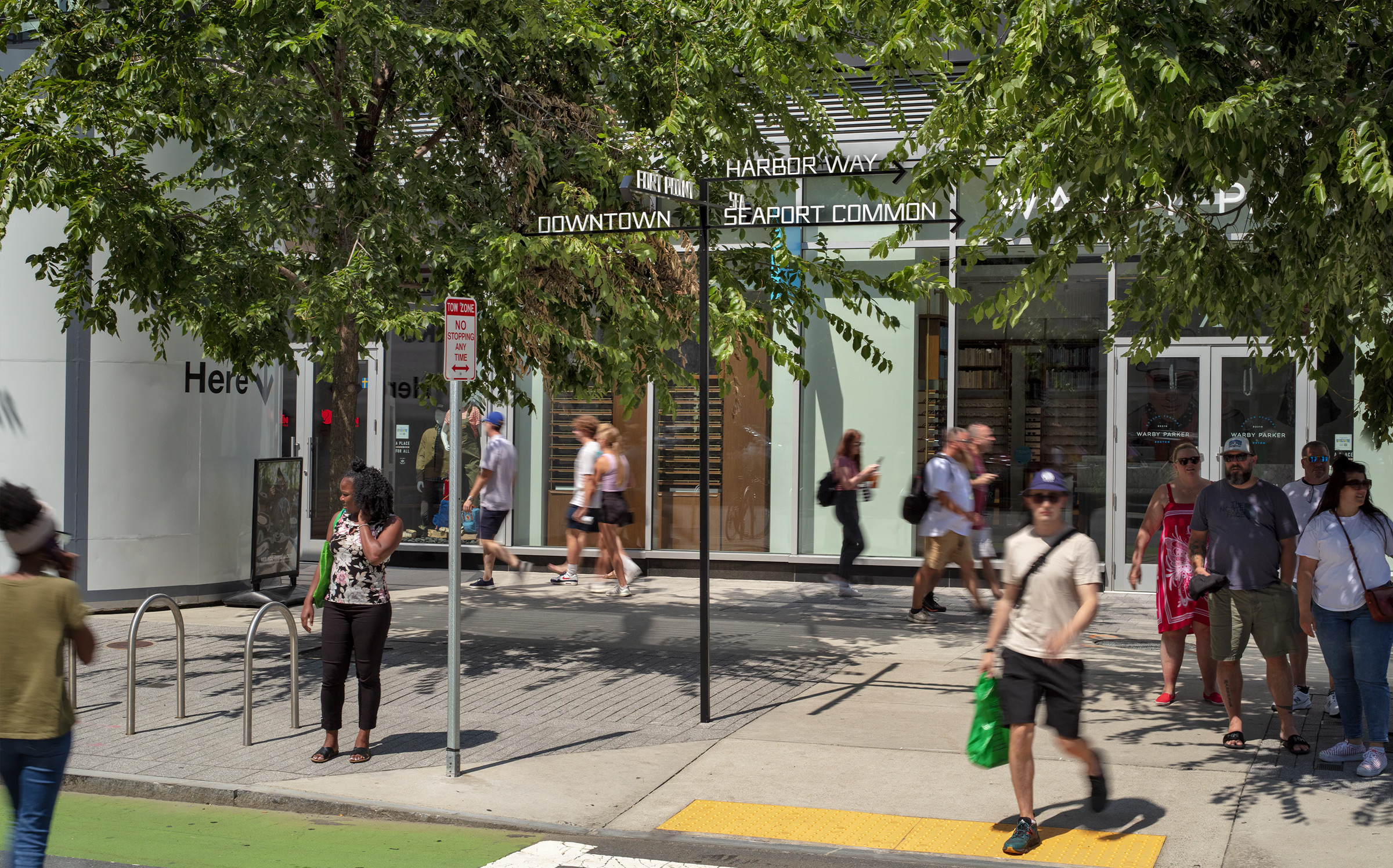
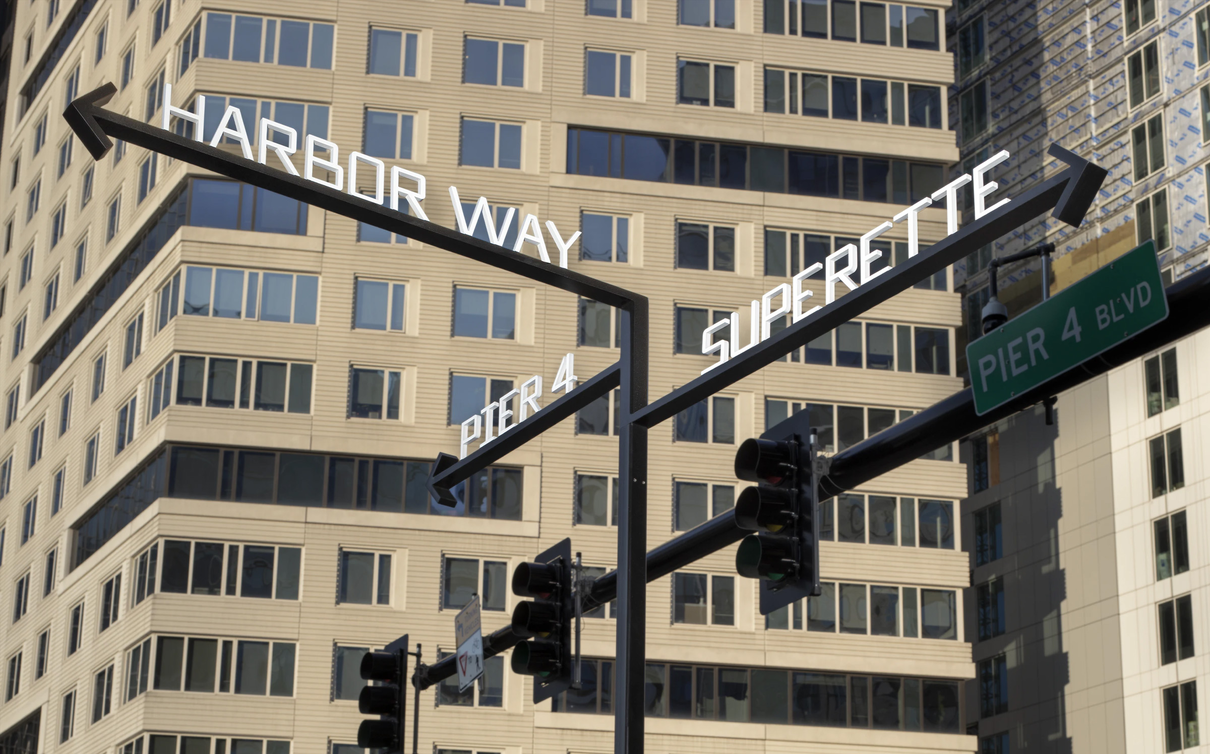
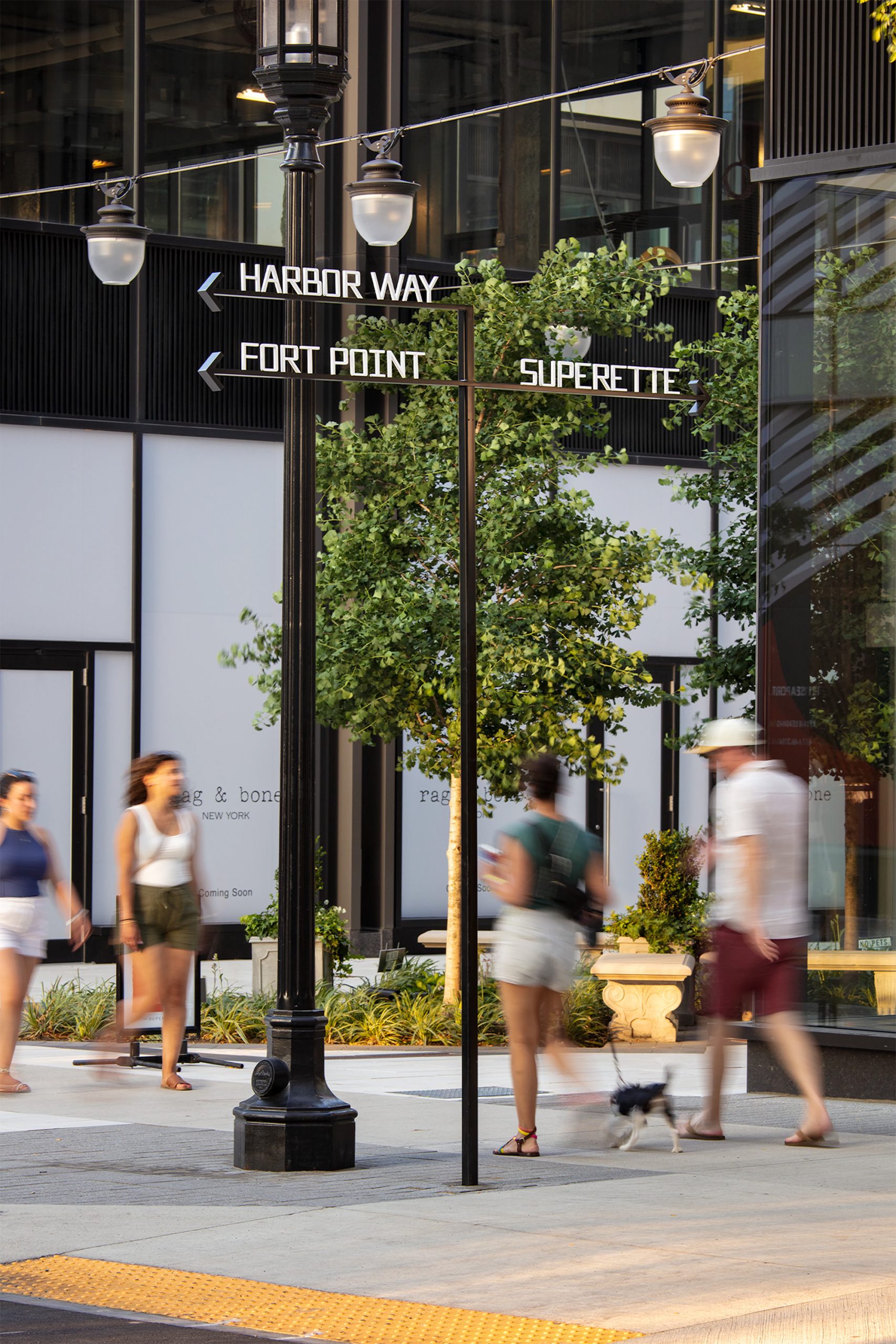
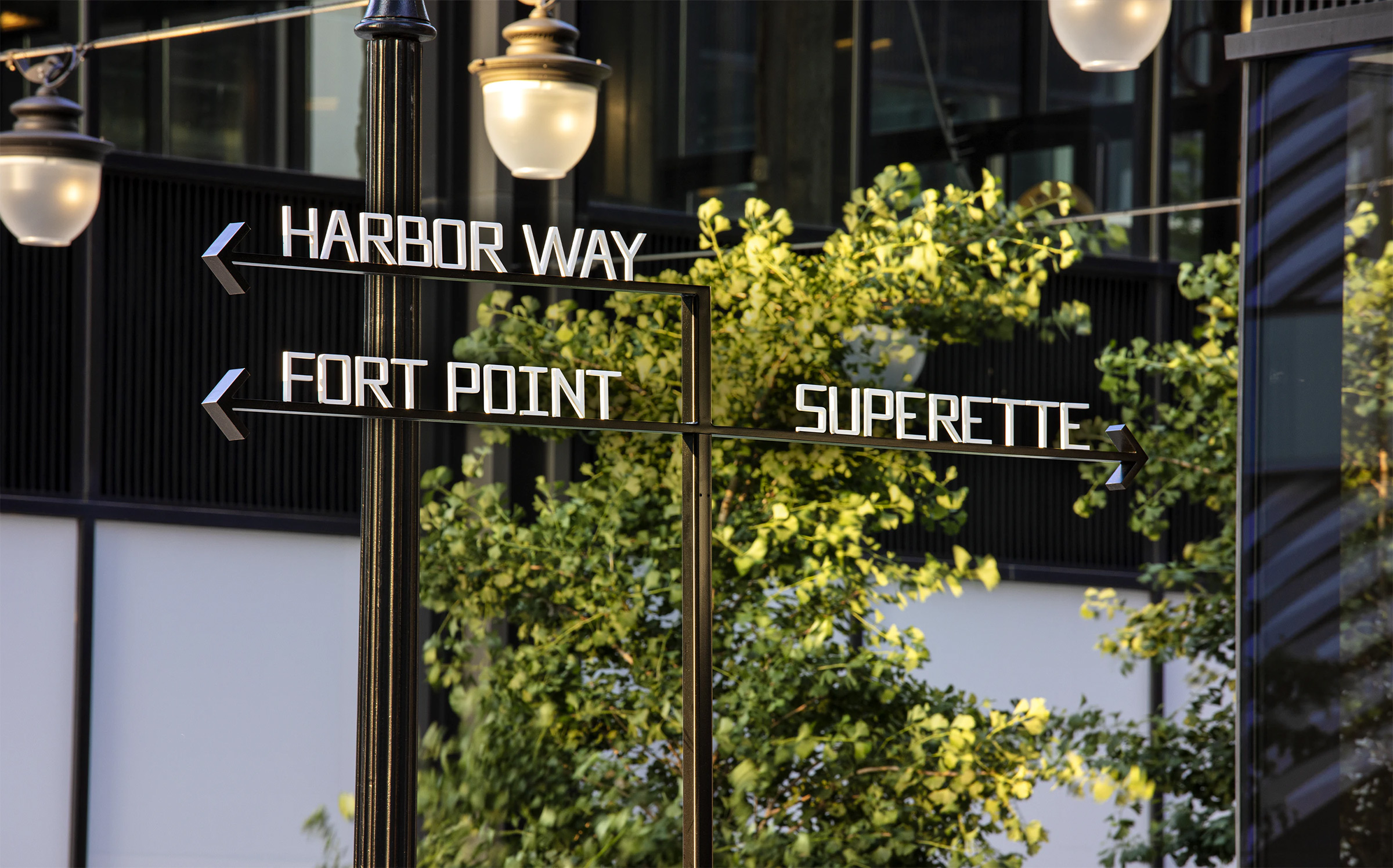
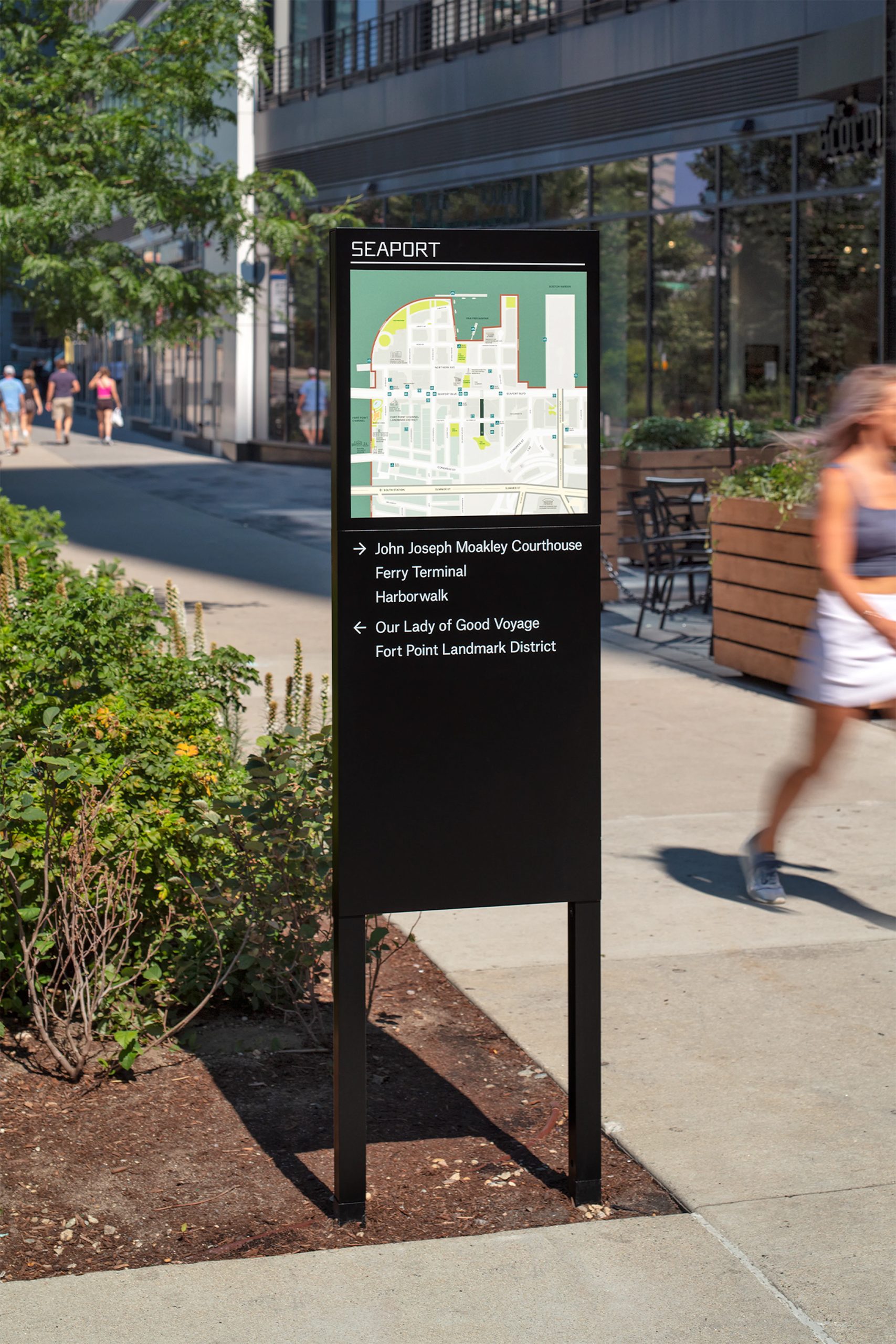
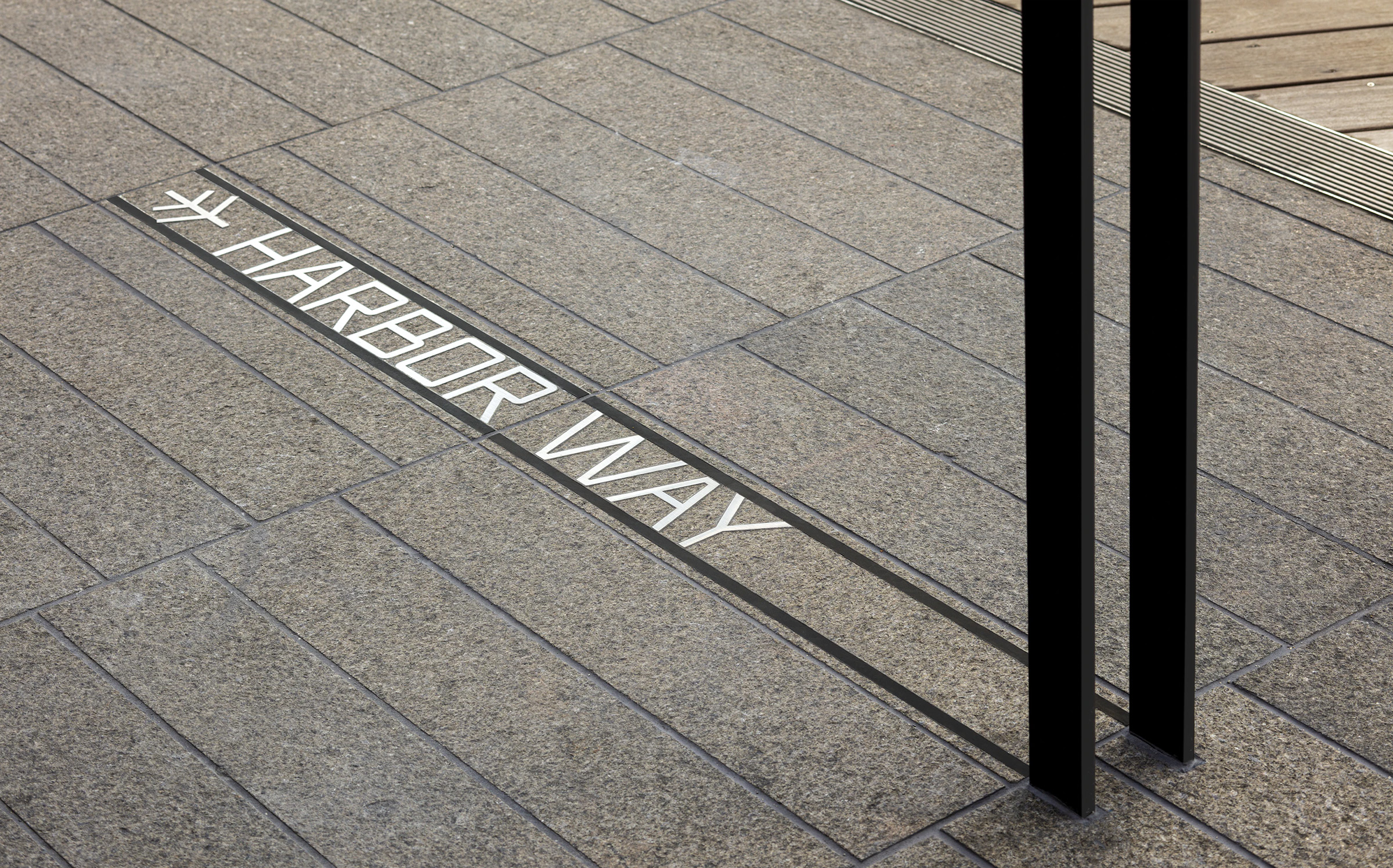
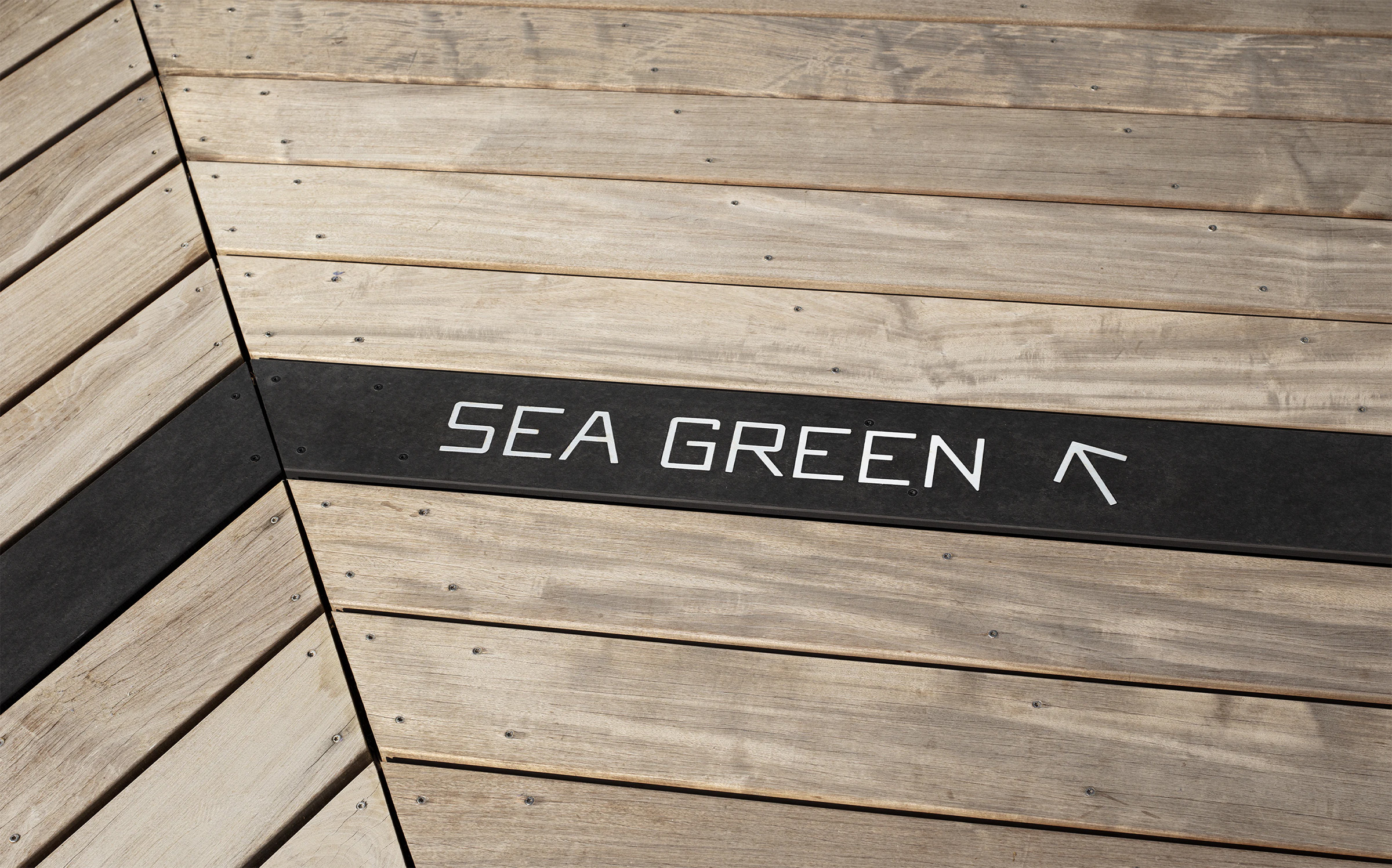
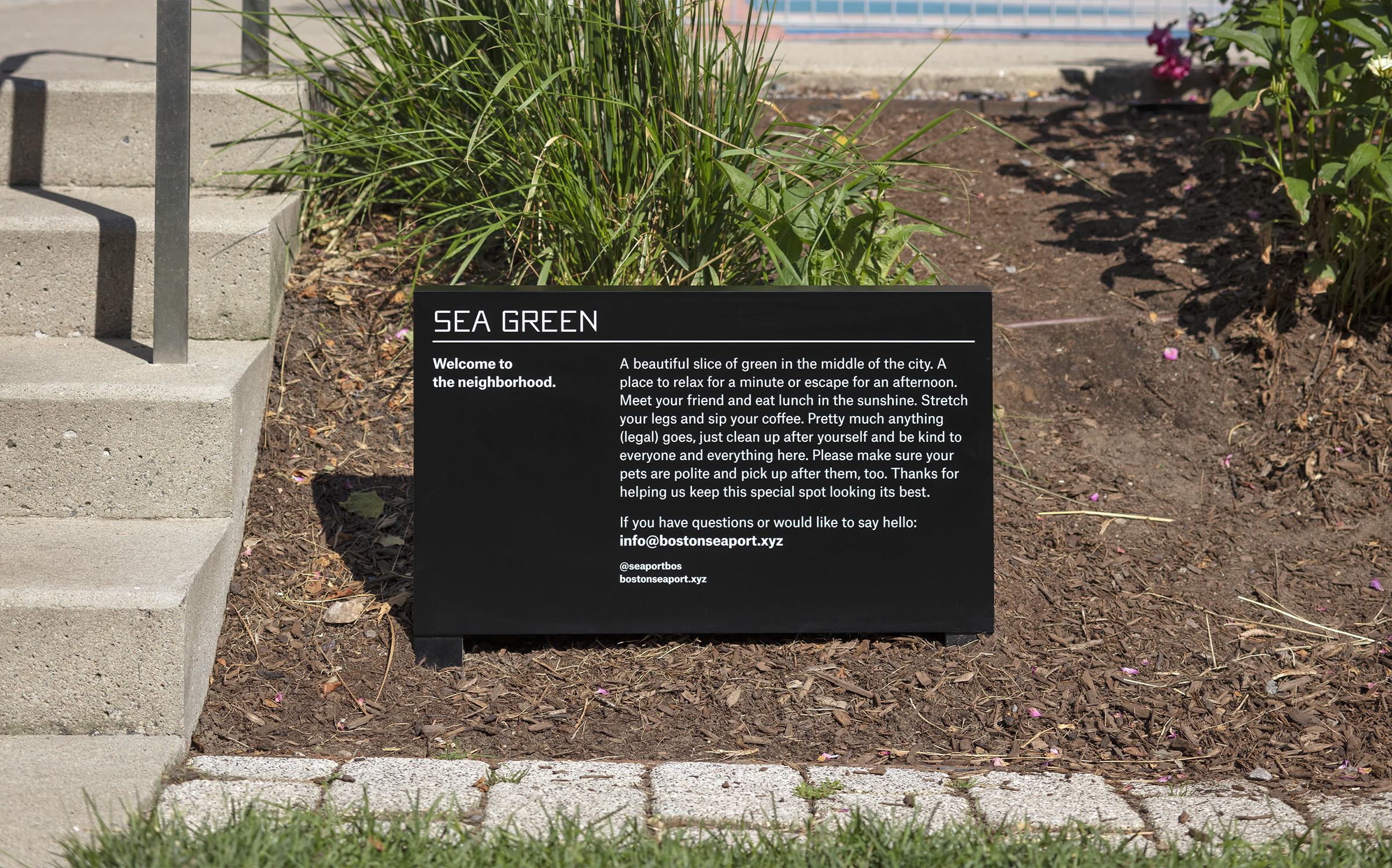
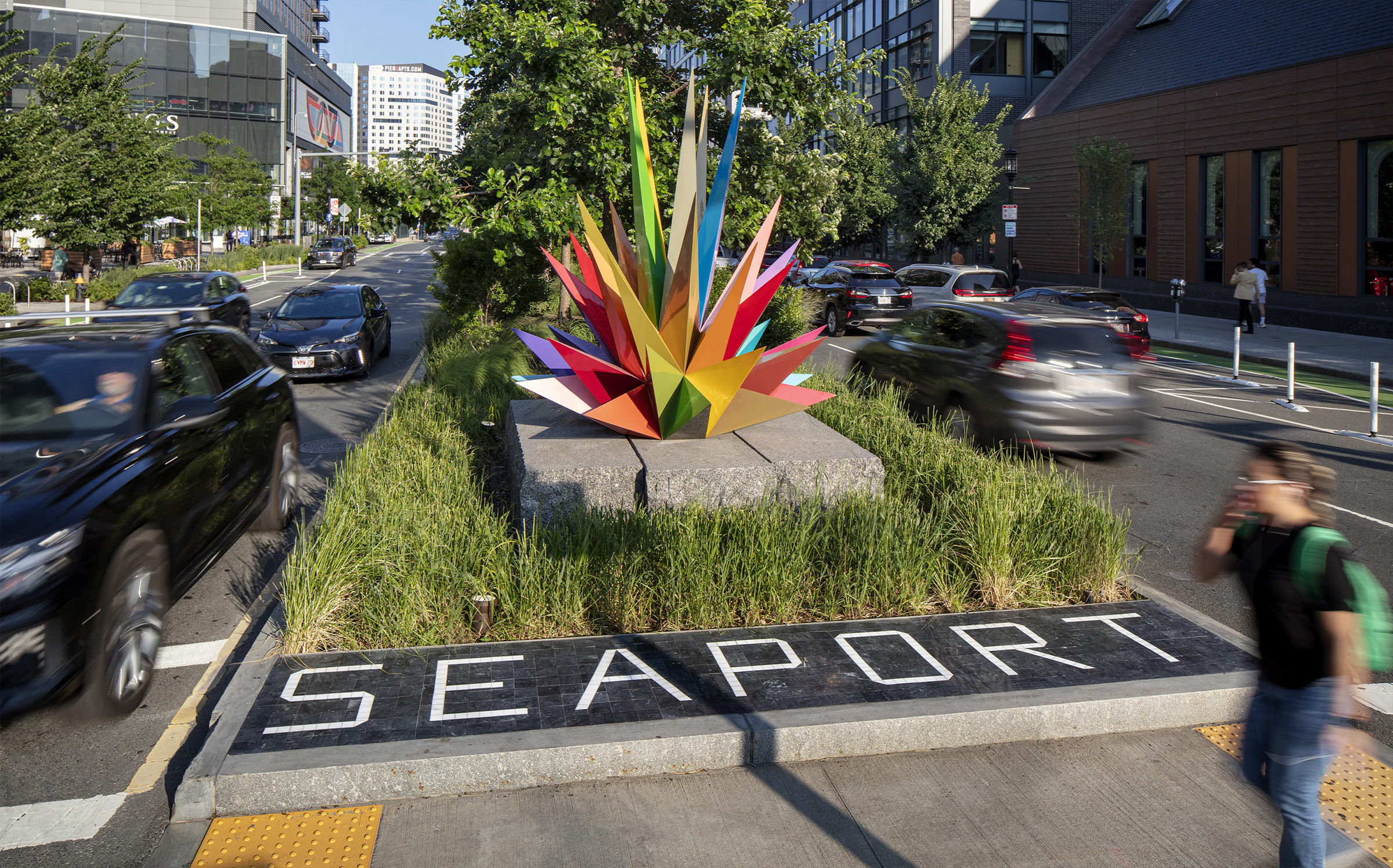
The logo draws from the chevron pattern of the boardwalk, the forest trees in the park and Harbor Way’s position as a central path through the masterplan. The typography appears in three dimensions on pole-like directional signs made of powder-coated stainless steel, with arrows that evoke hand-crafted New England weathervanes. Other signage is embedded as planks within the boardwalk, and freestanding kiosks feature maps of the district.
“The black and white color palette for the signage is simple, timeless, elegant, and feels civic in nature,” says Prange. “We wanted the signage to feel like it belonged in the space and was there before we started developing this land, and this design achieved that goal… Everyone loves the boardwalk signage and can’t wait for the rest of the phased program to be installed.”
“The black and white color palette for the signage is simple, timeless, elegant, and feels civic in nature,” says Prange. “We wanted the signage to feel like it belonged in the space and was there before we started developing this land, and this design achieved that goal… Everyone loves the boardwalk signage and can’t wait for the rest of the phased program to be installed.”