Enviromeant
  • Wayfinding
  • Restaurants
  • Workplace
  • Signage
  • Exteriors
  • Interiors
888 Likes
637 Followers
2K Followers
Enviromeant
Enviromeant Enviromeant
  • Wayfinding
  • Restaurants
  • Workplace
  • Signage
  • Exteriors
  • Interiors
  • Exhibitions
  • Signage

FitNation

  • March 27, 2014
  • Mariana
Total
32
Shares
0
0
32

Architecture and urban design have become important tools in the fight against obesity and related chronic diseases. Practical changes to the design of buildings, towns and cities—locating stairs for visibility, creating networks of well-marked bike lines, designing streetscapes that are inviting for pedestrians—can help encourage physical activity and make the built environment more conducive to healthier lifestyles.

Pentagram’s Luke Hayman and team have been involved in several projects related to these initiatives, including the design of the Active Design Guidelines, issued by the New York City Department of Design and Construction in 2010, and the creation of the graphic identity for the Center for Active Design.

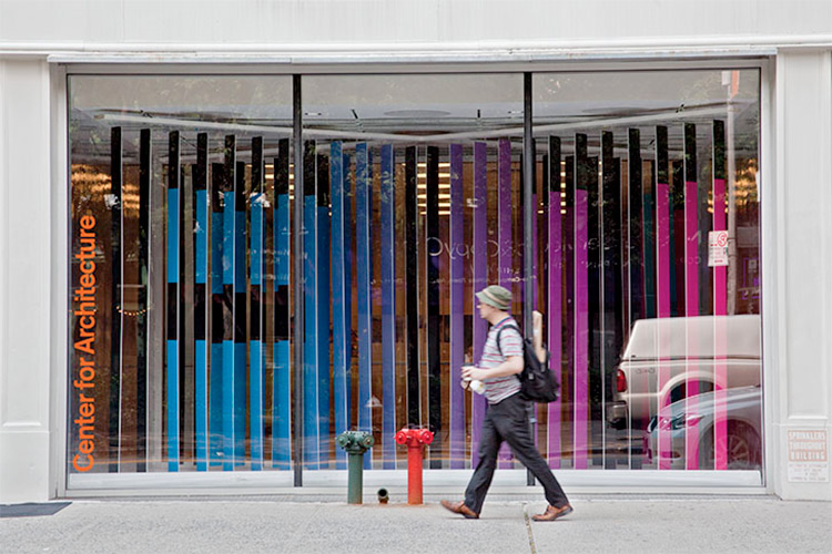
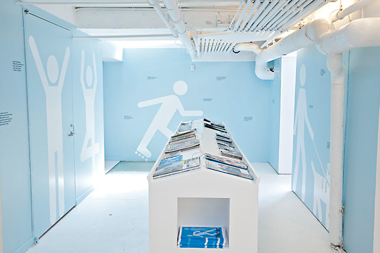
These strategies are currently highlighted in FitNation, an exhibition at the Center for Architecture in New York. Hayman and team have created the graphics for the exhibition, extending their design for the Active Design Guidelines and the recent FitCity conferences into playful supergraphics that illustrate the different ways environments can help people stay physically fit. The exhibition was designed in collaboration with Abruzzo Bodziak Architects and is scheduled to travel following its run at the Center.

FitNation. Designed by Pentagram @enviromeant.com

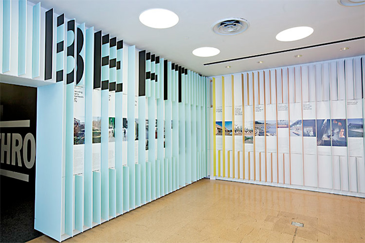
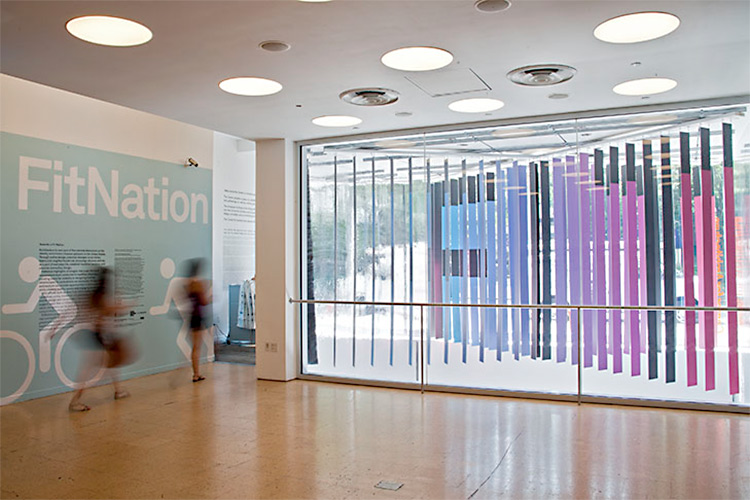
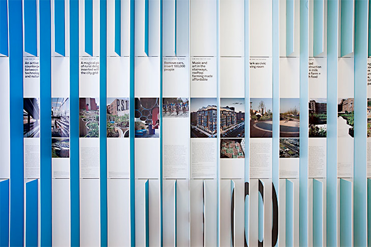
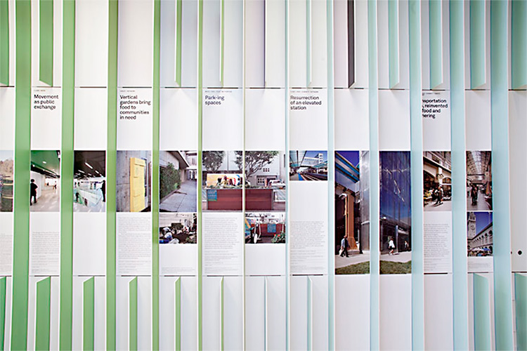
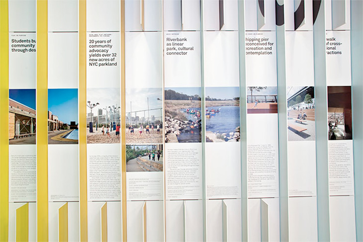
ABA’s design for the main gallery features a distinctive pattern of “fins” that extend from the walls and activate the space. Hayman and his team have placed typography on the bas-relief panels that form words when viewed from certain perspectives, including a colorful display in the Center’s storefront window that forms the word “FIT.” In wall displays, the fins are used as a grid to organize the exhibition content, similar to Hayman’s layout for the original Active Design Guidelines. Typography is set in Akkurat.

FitNation. Designed by Pentagram @enviromeant.com

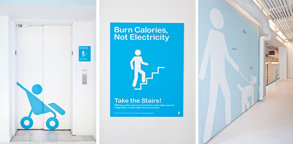
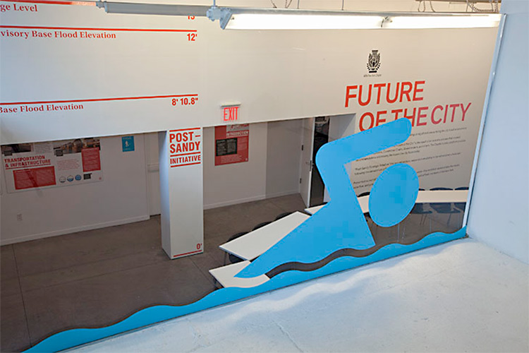
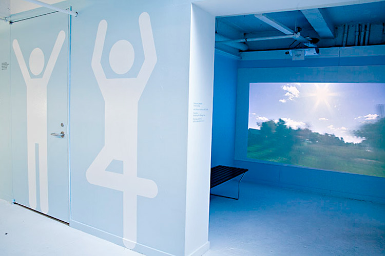
Other walls feature life-size pictogram figures engaged in activities like taking the stairs, skating across the gallery, or swimming in a window. The supergraphics are punctuated with small statements and suggestions about how to make design and architecture more physically engaging. A display of books on the subject features silhouettes of the iconic eyewear of famous architects like Le Corbusier, Daniel Liebeskind and Philip Johnson.

The team also created promotional graphics for the exhibition, including an animated announcement for an architectural ping-pong tournament and posters for the New York City Subway, as well as a newsprint catalogue that doubles as a workbook for ways to stay active.


FitNation. Designed by Pentagram @enviromeant.com

Project Team: Luke Hayman, partner-in-charge and designer; Shigeto Akiyama and Ellen Peterson, designers.
Text and photography copyright of Pentagram.

Total
32
Shares
Share 0
Tweet 0
Pin it 32
Related Topics
  • Abruzzo Bodziak Architects
  • Akkurat
  • architecture
  • Center for Active Design
  • design
  • egd
  • Ellen Peterson
  • enviromeant
  • environmental graphics
  • fit
  • fitnation
  • Luke Hayman
  • nation
  • pentagram fitness
  • segd
  • Shigeto Akiyama
Mariana

Mariana Pacheco is a visual designer, founder of Design Etiquette. She specializes in branding and web design. She loves Environmental Graphics Design as well.

Previous Article
  • Interiors
  • Restaurants

Hubbly Bubbly Falafel Shop

  • March 25, 2014
  • Mariana
View Post
Next Article
  • Education
  • Interiors
  • Museums
  • Signage
  • Wayfinding

The Thinkery

  • April 10, 2014
  • Mariana
View Post
You May Also Like
View Post
  • Exteriors
  • Featured
  • Signage
  • Wayfinding

Dublin Docklands

  • Mariana
  • December 27, 2020
View Post
  • Featured
  • Signage
  • Workplace

Objective Paradigm

  • Mariana
  • October 23, 2020
View Post
  • Exhibitions
  • Featured
  • Interiors

Across the Dotted Line

  • Mariana
  • August 23, 2019
View Post
  • Featured
  • Interiors
  • Signage
  • Wayfinding

Sina Plaza

  • Mariana
  • April 12, 2019
View Post
  • Interiors
  • Signage
  • Wayfinding

Primus Hotel Sydney

  • Mariana
  • February 13, 2019
View Post
  • Placemaking
  • Signage
  • Wayfinding

Drakes Foodland Wayville

  • Mariana
  • November 26, 2018
View Post
  • Museums
  • Signage

Migration Museum

  • Mariana
  • October 3, 2018
View Post
  • Exteriors
  • New Posts
  • Signage
  • Wayfinding

Nicollet

  • Mariana
  • April 27, 2018

Leave a Reply Cancel reply

Your email address will not be published. Required fields are marked *

Wayfinding
Workplace
Restaurants
    • Exteriors
    • Featured
    • Signage
    • Wayfinding

    Dublin Docklands

      • Exteriors
      • Featured
      • Signage
      • Wayfinding
    View Post
    • Exteriors
    • Featured
    • Restaurants

    UHill Walls

      • Exteriors
      • Featured
      • Restaurants
    View Post
    • Featured
    • Interiors
    • Placemaking
    • Workplace

    Undisclosed Tech Client

      • Featured
      • Interiors
      • Placemaking
      • Workplace
    View Post
Instagram
@joannebyrne.hello designed this signage system for Dublin’s Docklands. The signage highlights six sites of interest along the Dublin Docklands section of the River Liffey. Illustrations accompany the description of each place of interest, most of which can be seen from the location of the panel. The title is fret cut from powder-coated metal and the design is screen printed.
Beautiful signage system designed by @joannebyrne.hello for Dublin’s Docklands.⠀
@joannebyrne.hello designed this signage system for Dublin’s Docklands. The signage highlights six sites of interest along the Dublin Docklands section of the River Liffey. Illustrations accompany the description of each place of interest, most of which can be seen from the location of the panel. The title is fret cut from powder-coated metal and the design is screen printed.
Who doesn't love a life-size Scrabble? By @dlr_group 😍⠀
Textural typography for Li Ka Shing Library, part of Singapore Management University (SMU), created by @there_design⠀⠀
Incredible mural and space @WeWork Rio Claro 241.⠀
Follow
Follow Us
888
637
2K
302
Trending Posts
  • 1
    • Exteriors
    • Featured
    • Signage
    • Wayfinding
    Dublin Docklands
  • 2
    • Exteriors
    • Featured
    • Restaurants
    UHill Walls
  • 3
    • Featured
    • Interiors
    • Placemaking
    • Workplace
    Undisclosed Tech Client
  • 4
    • Featured
    • Signage
    • Workplace
    Objective Paradigm
  • 5
    • Exteriors
    • Featured
    Bright Walls

Subscribe

Subscribe now to our newsletter

@joannebyrne.hello designed this signage system for Dublin’s Docklands. The signage highlights six sites of interest along the Dublin Docklands section of the River Liffey. Illustrations accompany the description of each place of interest, most of which can be seen from the location of the panel. The title is fret cut from powder-coated metal and the design is screen printed.
Beautiful signage system designed by @joannebyrne.hello for Dublin’s Docklands.⠀
@joannebyrne.hello designed this signage system for Dublin’s Docklands. The signage highlights six sites of interest along the Dublin Docklands section of the River Liffey. Illustrations accompany the description of each place of interest, most of which can be seen from the location of the panel. The title is fret cut from powder-coated metal and the design is screen printed.
Who doesn't love a life-size Scrabble? By @dlr_group 😍⠀
Textural typography for Li Ka Shing Library, part of Singapore Management University (SMU), created by @there_design⠀⠀
Incredible mural and space @WeWork Rio Claro 241.⠀

The boundaries of design continue to blur, different disciplines start to merge, and the visualization of brand identity and communication start to widen.

Environmental graphic design is a discipline that merges architecture, interior, & graphic design in order to produce an integrated brand identity, create clear signage systems, and produce interactive and exciting environments.

Enviromeant is a showcase of the best and most interesting projects in the field of EGD.

  • Wayfinding
  • Restaurants
  • Workplace
  • Signage
  • Exteriors
  • Interiors

At Enviromeant we are always looking for interesting projects which accomplish to combine architecture, interior and graphic design. If you want to showcase your work, just send us an mail to submit@enviromeant.com with the images (Minimum 1800px wide) and a description of your project. We’ll be happy to review it for submission.

Enviromeant
A blog about Environmental Graphic Design, Signage & Wayfinding Systems.

Input your search keywords and press Enter.