The Design, Architecture & Building Faculty for the University of Technology is located in Haymarket in the heart of Sydney. In early 2009 the facility started a major upgrade, primarily in the Fabrication Workshop and Photomedia Laboratory.
Gardner Wetherill Associates redefined the spaces into a modern environment more suited to this highly regarded institution. BrandCulture was engaged to make these spaces reflect contemporary technology and culture through the use of environmental graphics.
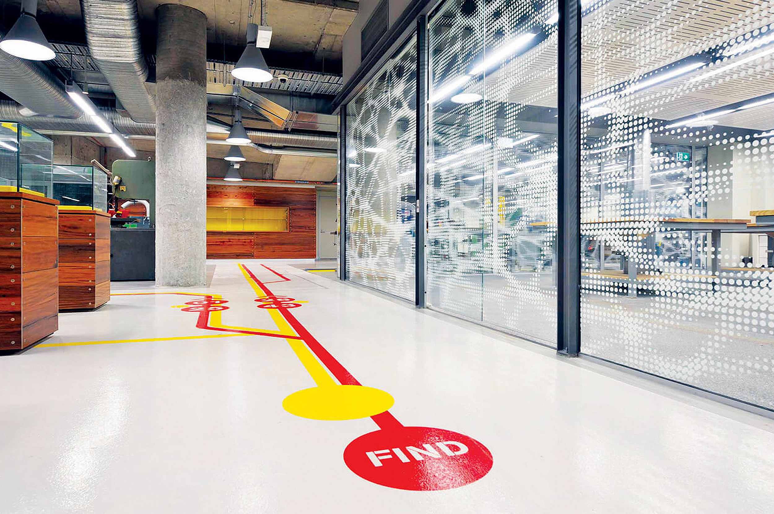
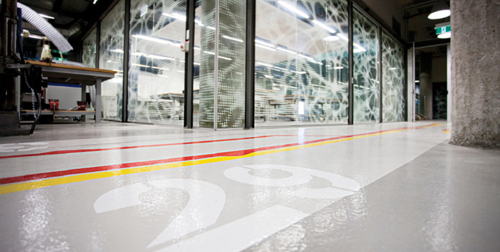
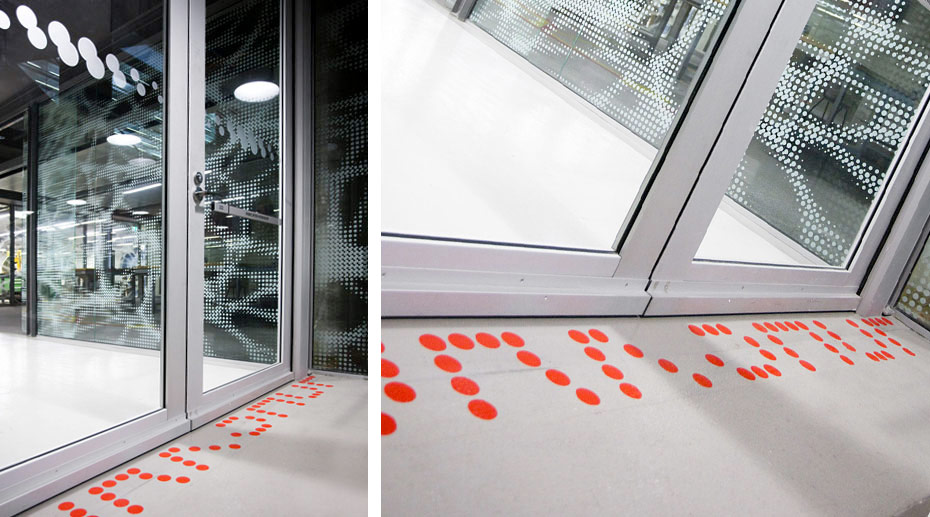
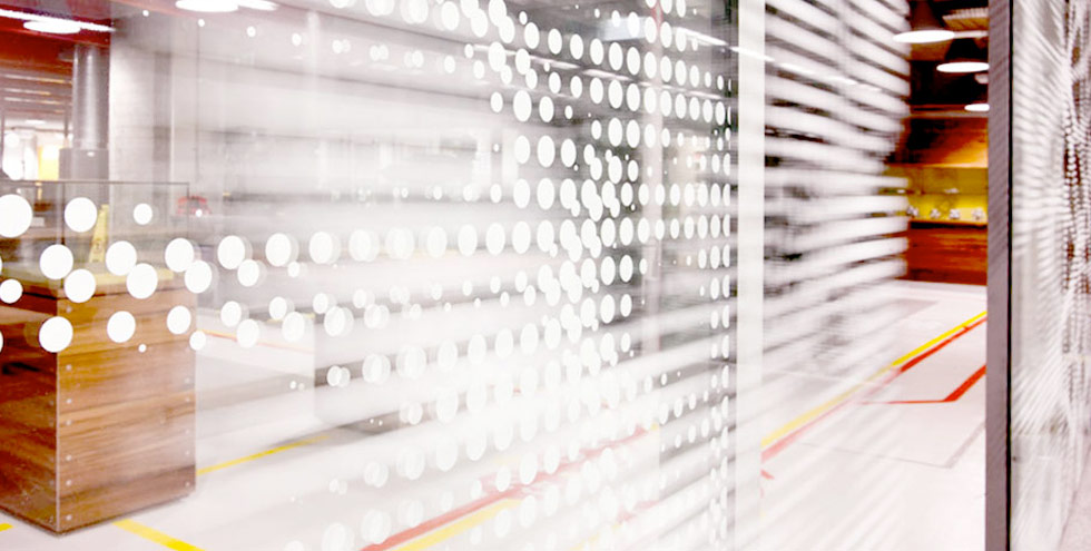
The workshop is divided into three main areas; a 24 hour studio, the laser room and the main workshop floor. For OH&S requirements, the 24 hour studio workshop and laser room were required to maintain a clear line-of-sight across the workshop. It also required a level of seclusion so occupants would not be continually distracted by other activities. As a visual tribute to modern architecture (Herzog & Demeuron), the stretched form was created with a large dot screen running throughout to allow for visibility.
‘We are interested in the surface,” Herzog explains, ”not as pure decoration but for its capacity to have an impact on the space.” With the addition of pattern or, at Dominus, of texture, a building takes on a different character under different conditions, emerging or receding as the light changes, becoming more solid or less substantial.” So that it’s not the geometrical space you give it once and for all as an architect,” Herzog explains.
Despite the wall that has divided fashion and architecture, their progress in our time has been remarkably parallel. ”Clearly, all things in contemporary culture are related,” Herzog says. In clothes and in buildings, transparency has become one of the hallmarks of the 90’s, as fashion designers utilize chiffon, mesh and other sheer materials, and architects turn to glass, screens and scrims. Herzog speculates that in both cases the fascination is the same. ”It is always the curiosity about what lies behind or beyond or beneath the surface,” he says. ”The transparency creates a certain ambiguity, an interplay between the inside and the outside.”
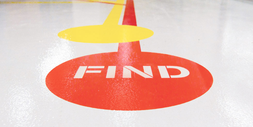
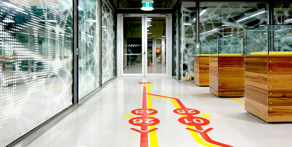
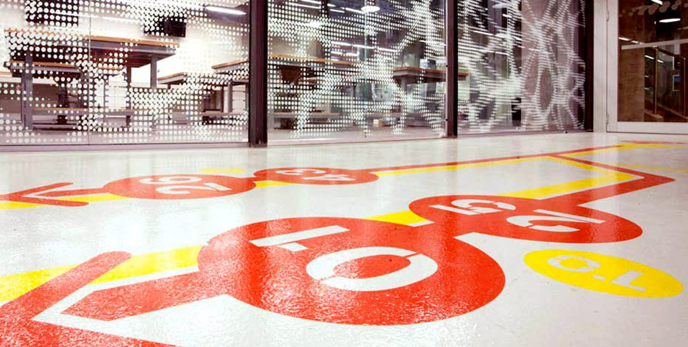
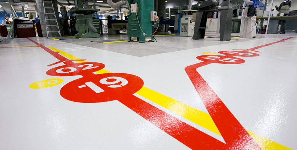
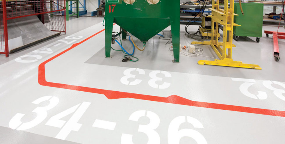
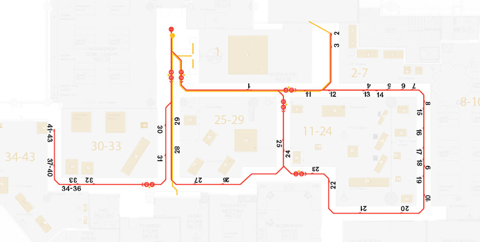
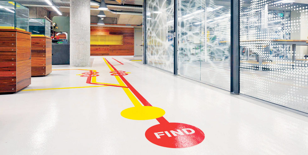
The main workshop floor required a clearly delineated walkway for safety, this feature became the key graphic wayfinding interpretation. The system had to resolve two issues: to find machines by number; and to lead the eye to several displays celebrating the students work. The result pays tribute to modern iconic graphic styling with an engineering influence, featuring bold use of the flooring area.
Text and photography copyright of Brand Culture


