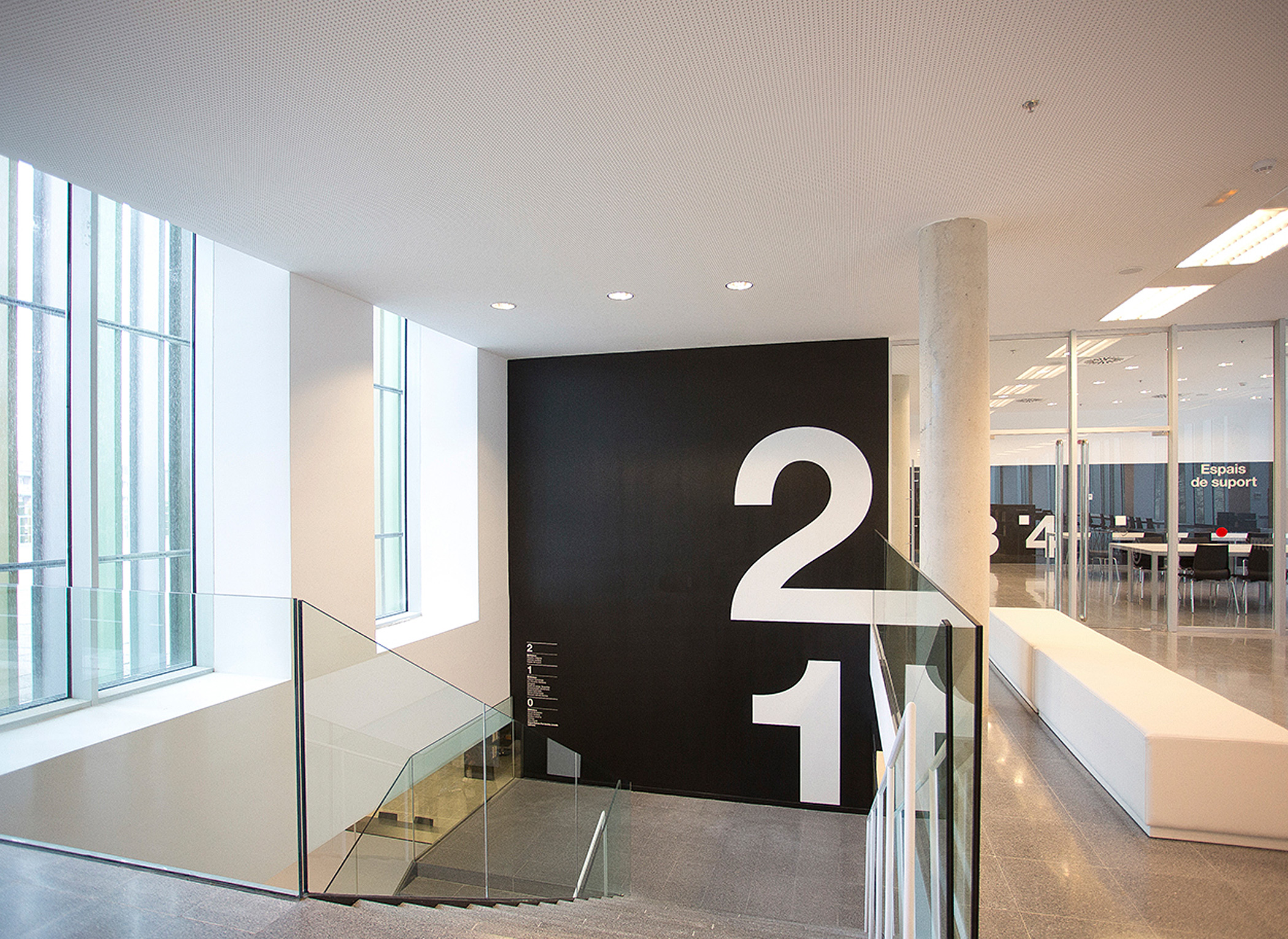
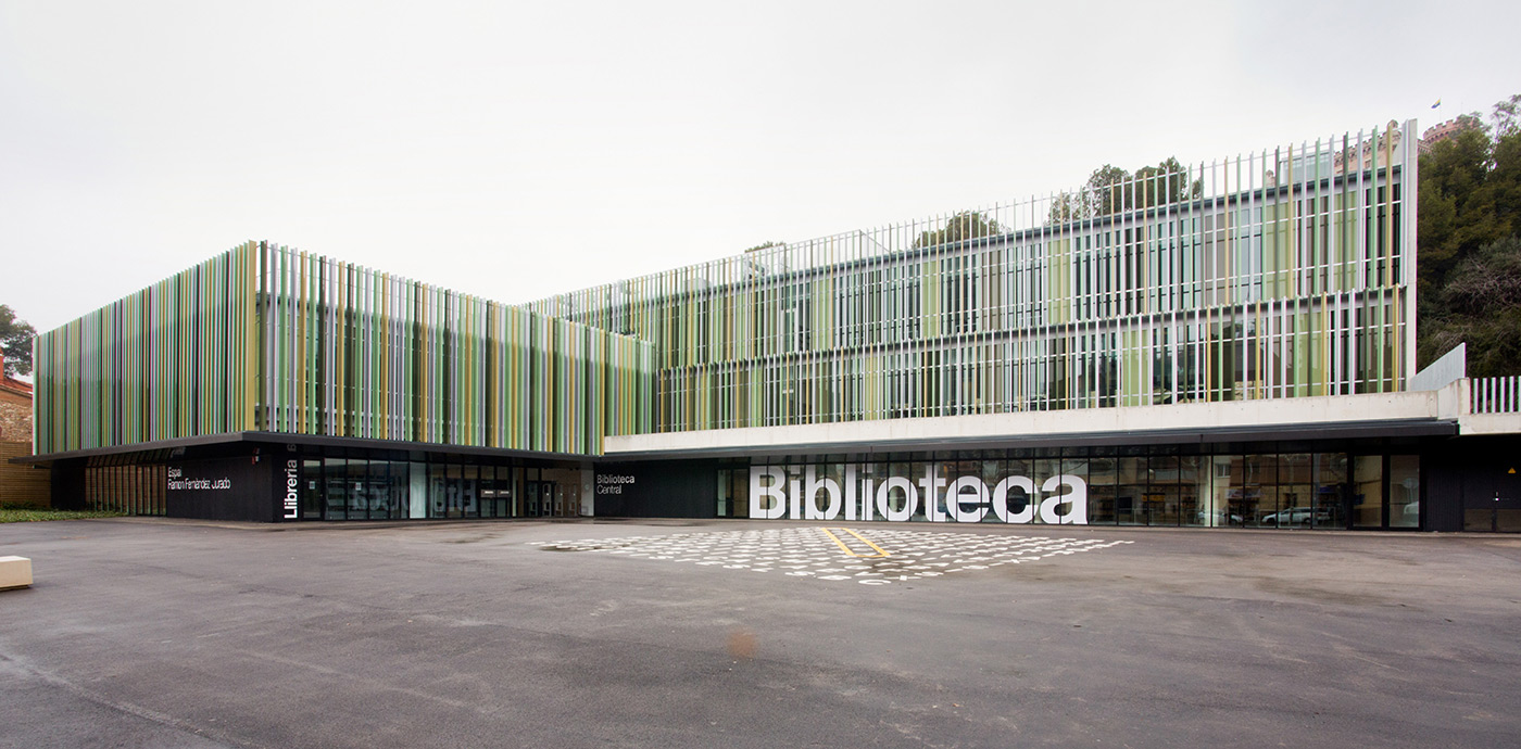
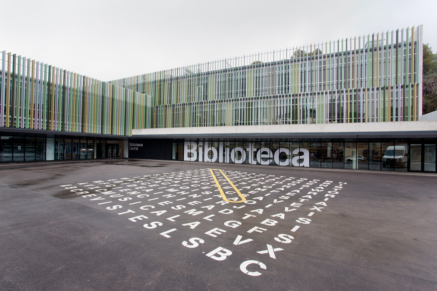
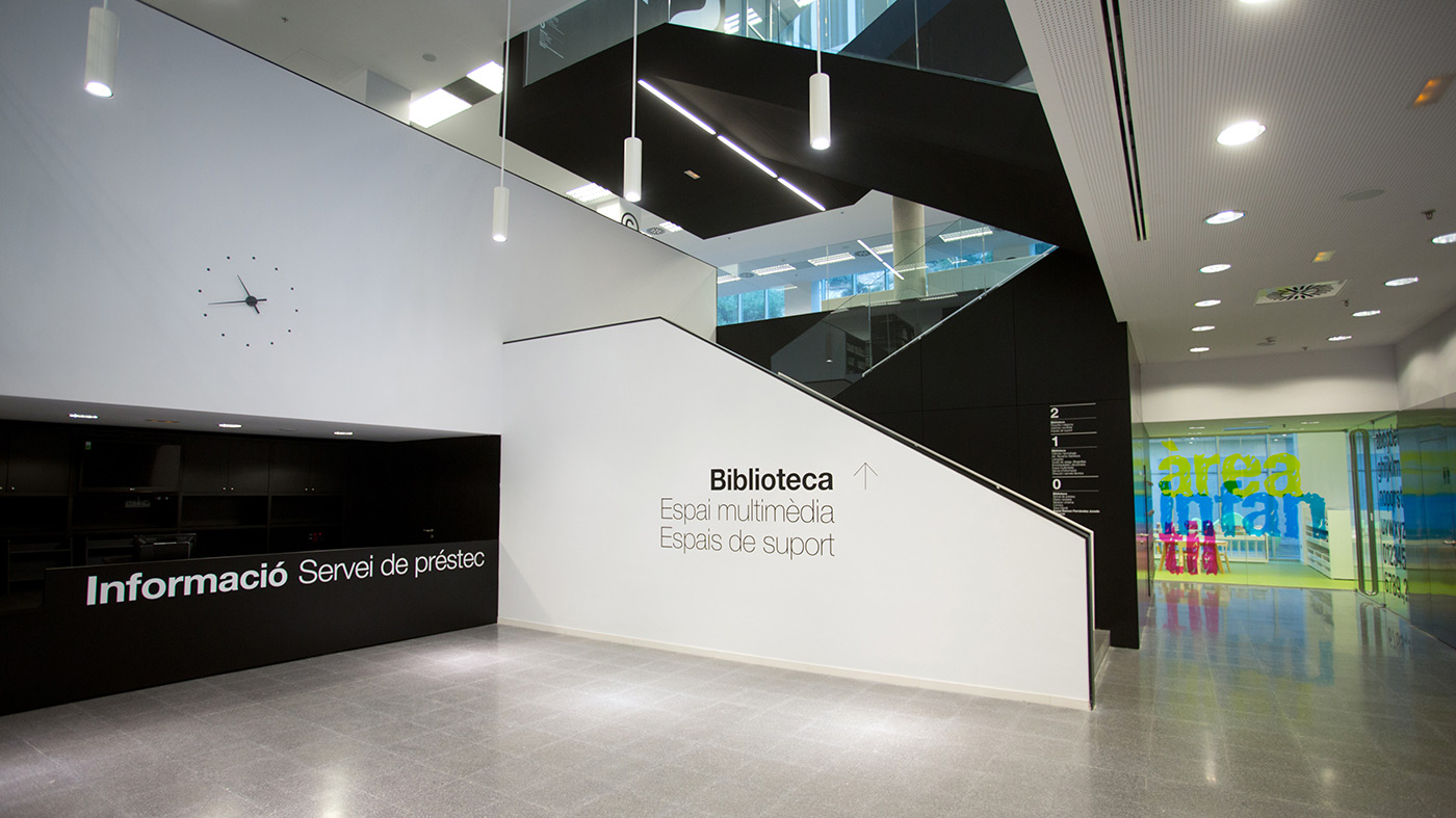
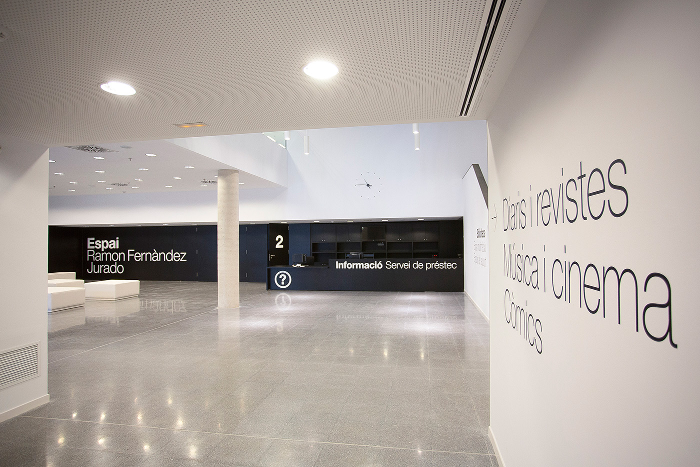
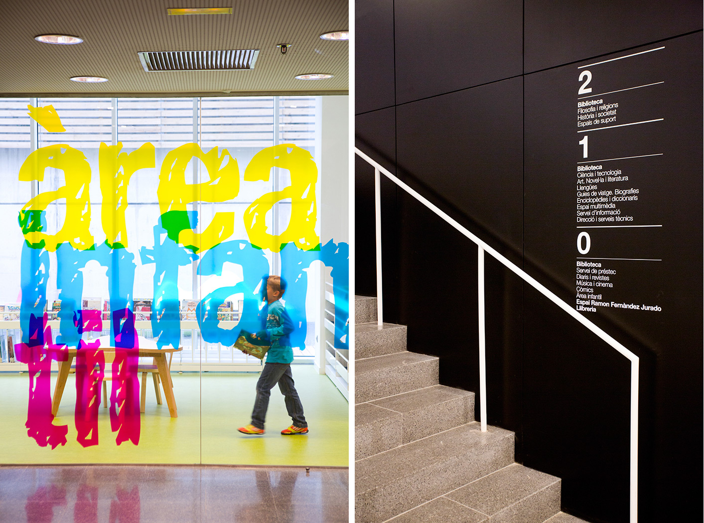
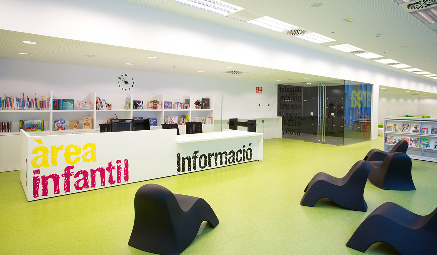
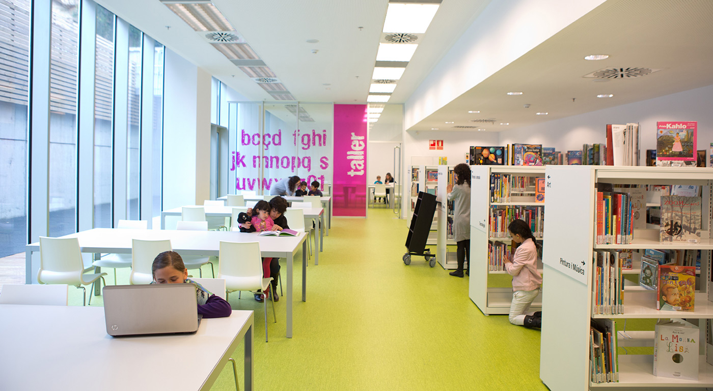
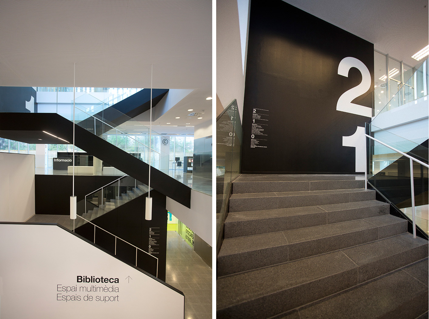
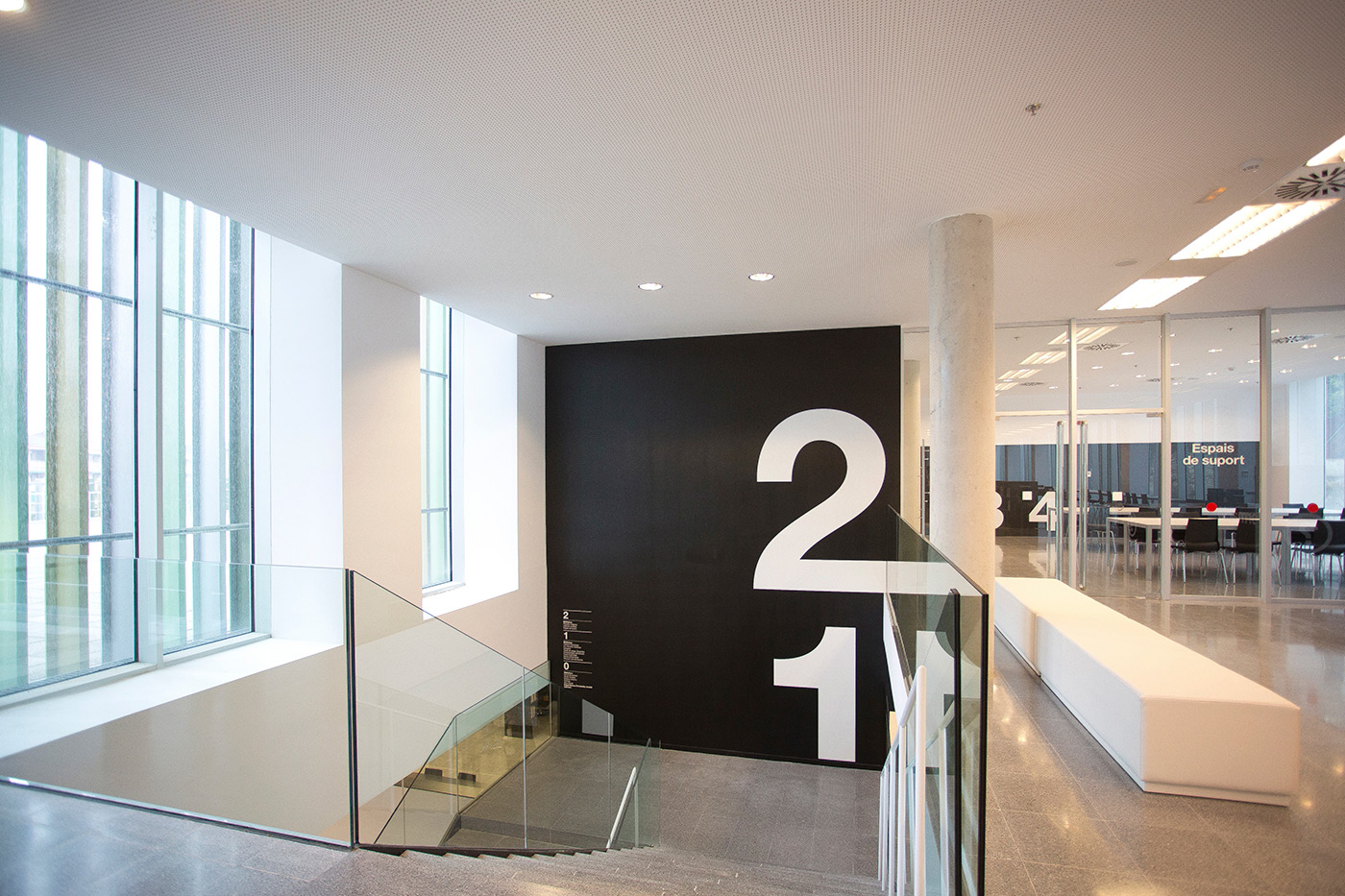
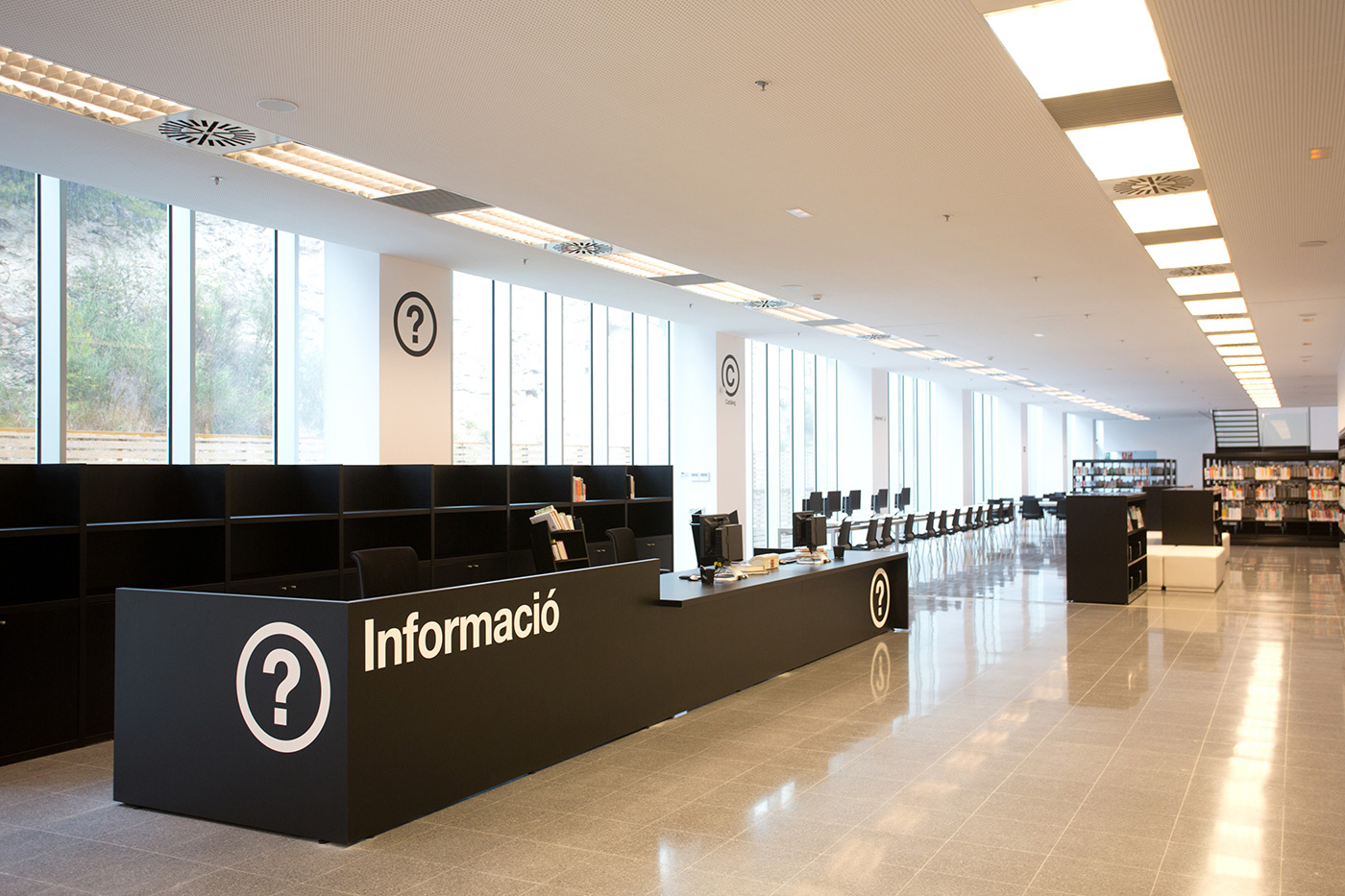
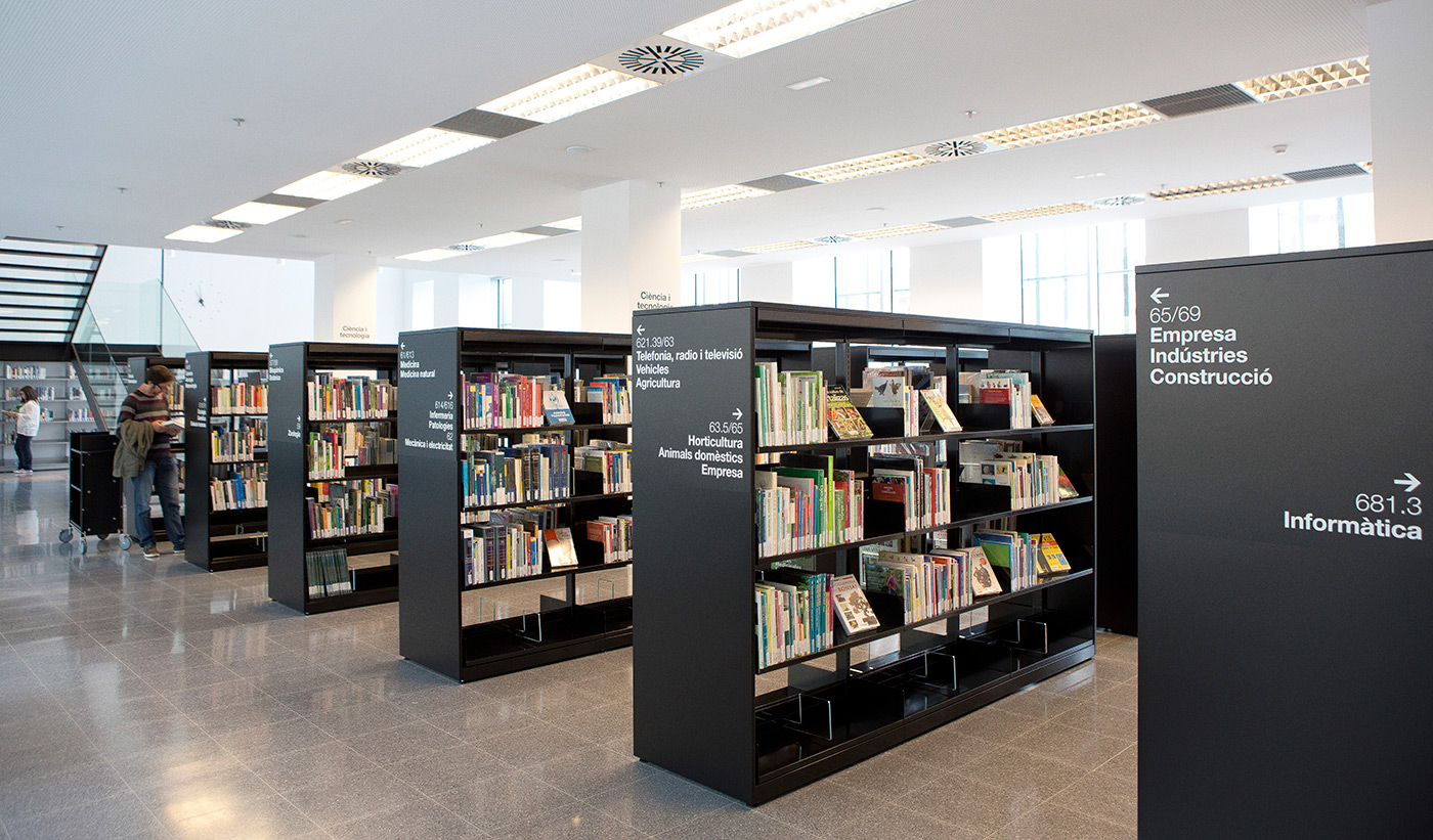
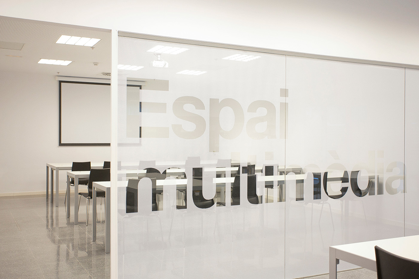
Black and white with a splash of color is always a great way to go when designing an elegant and clear wayfinding system. Barcelona’s design studio PFP, Disseny Gràfic used big and bold typography to make Castelldefels’ Central Library come to life.
PFP was founded by Quim Pintó and Montse Fabregat, it works on Corporate Identity, Communication Strategy, Editorial Design, Exhibitions and Signage projects. By combining light and bold fonts, they’ve managed to empathize different sections of the building. The black and white scheme turns into color for every kid reading in the children’s area. Anyone visiting this project can admire that simplicity is beautiful.
Photography copyright of PFP, Disseny Gràfic.


