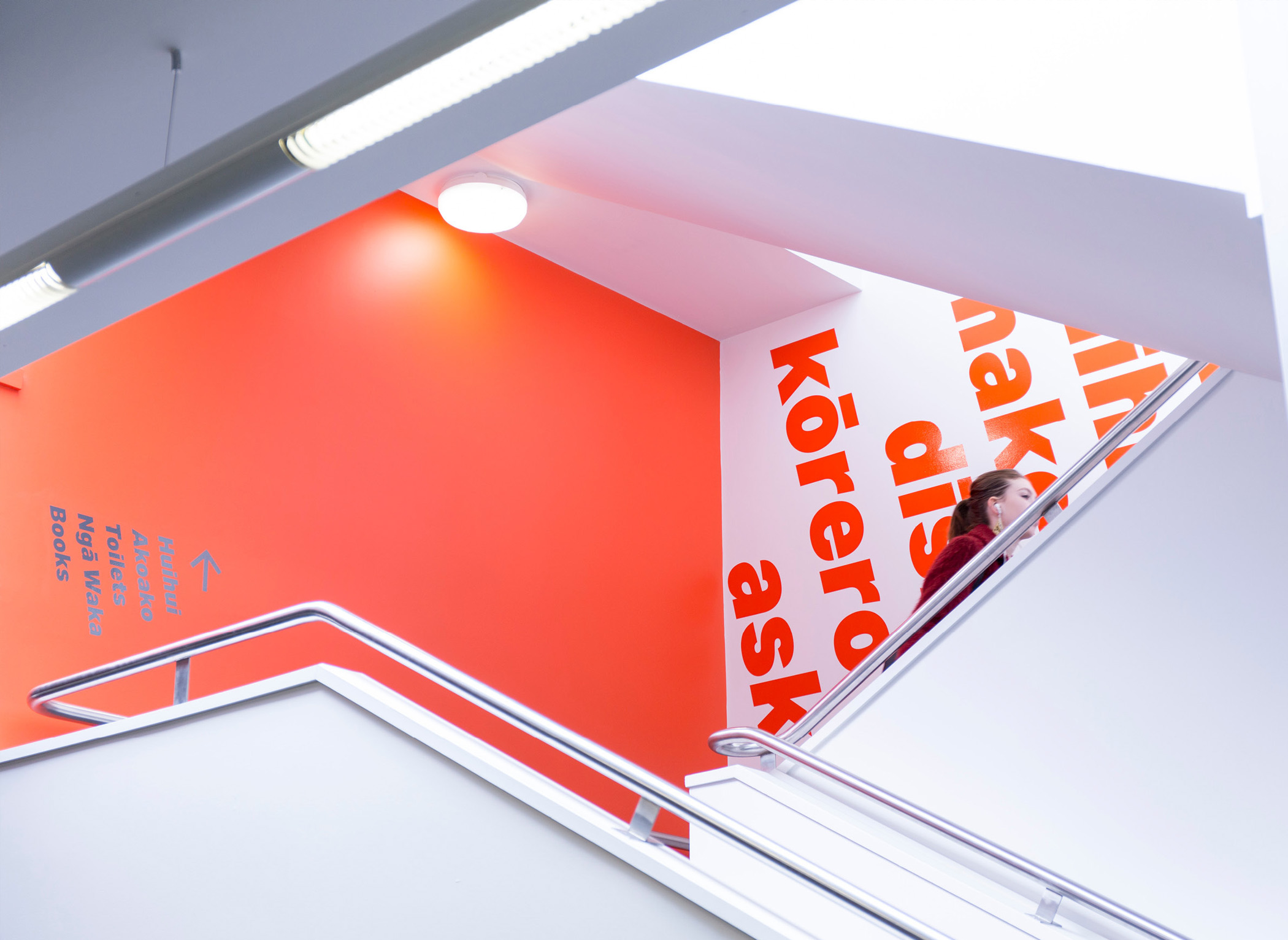
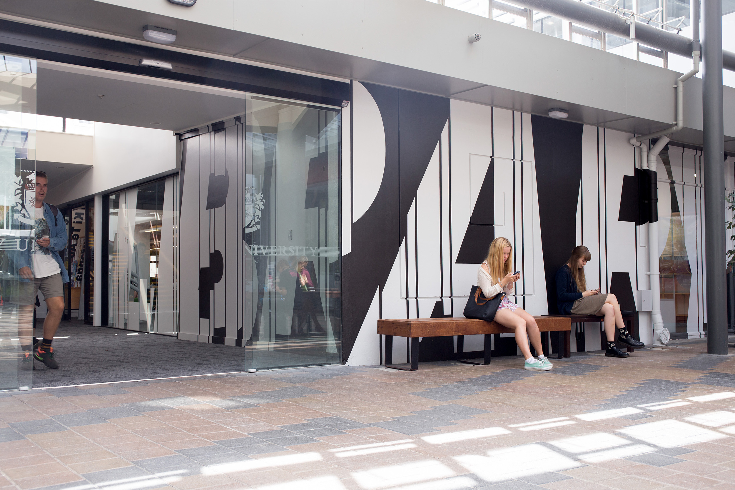
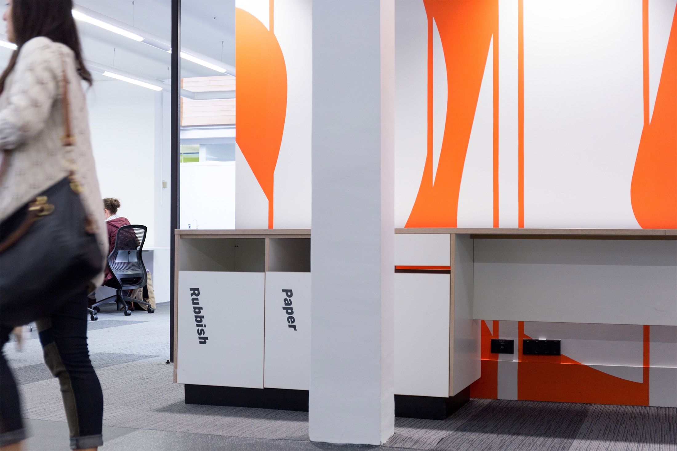
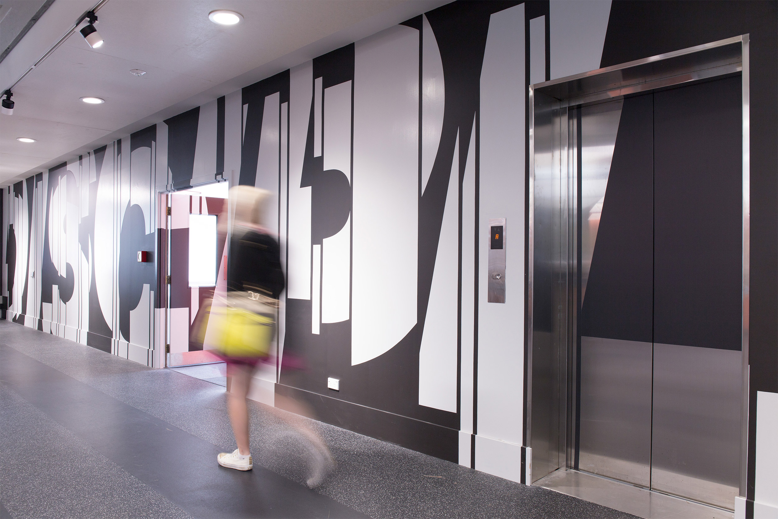
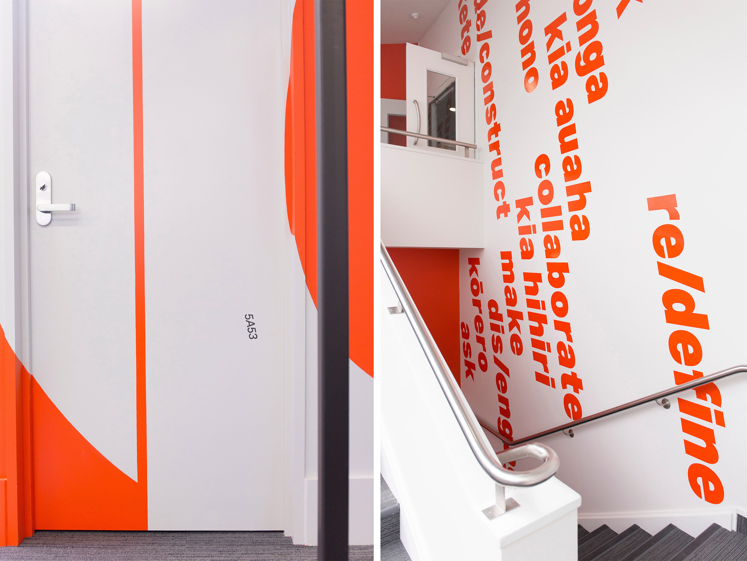
Strategy Design & Advertising, in collaboration with Athfield Architects, developed a flexible way-finding system and eye-catching super graphics that helped the library reclaim it’s relevance in the 21st century. Working closely with the architects and library staff, the concept of a ‘library’ was reinvented, redesigned and ultimately redefined. Helping the library to reclaim it’s relevance in the 21st century.
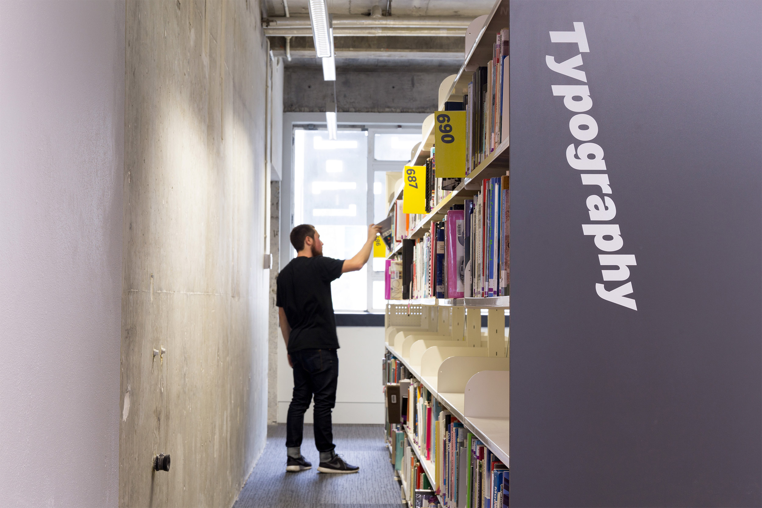
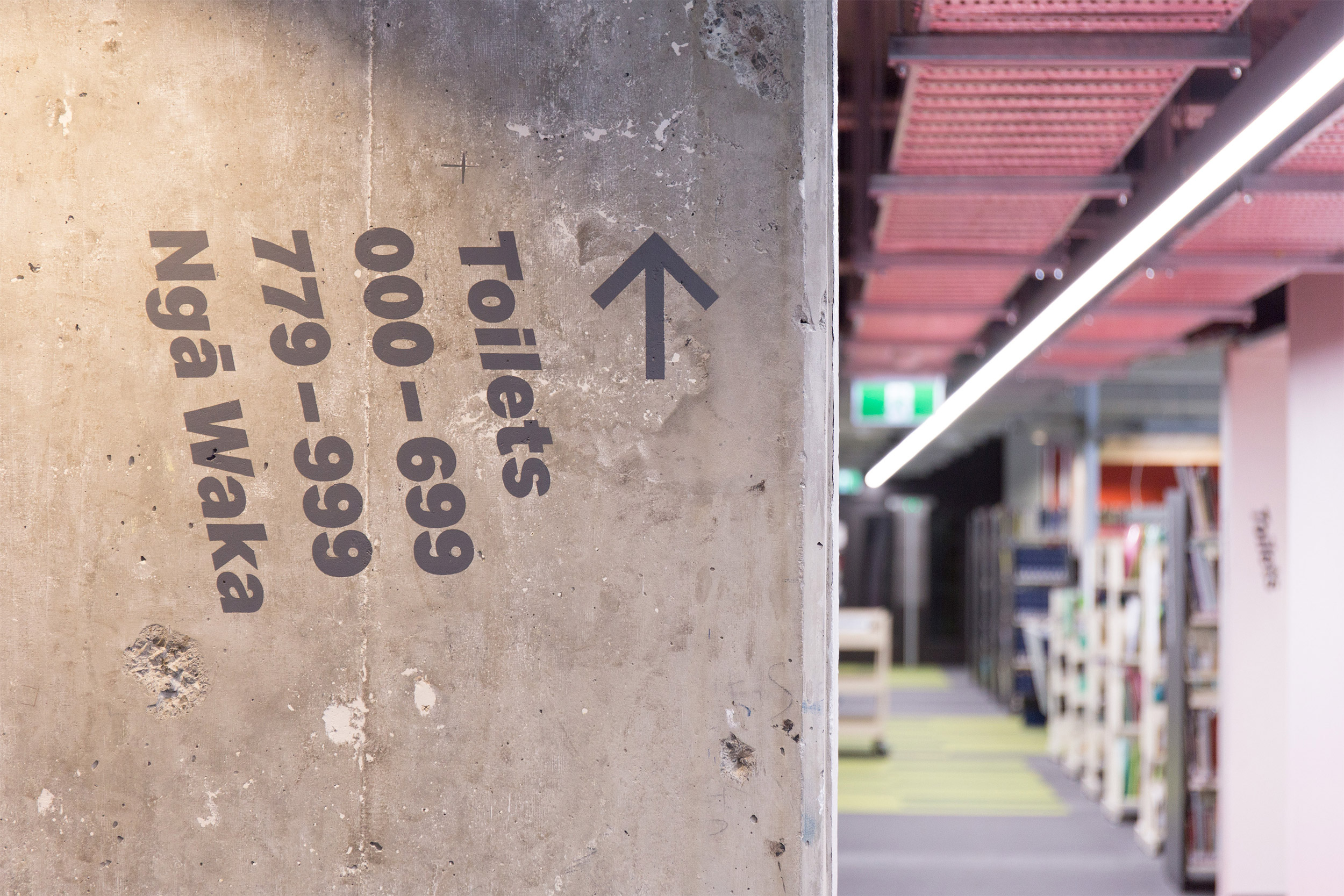
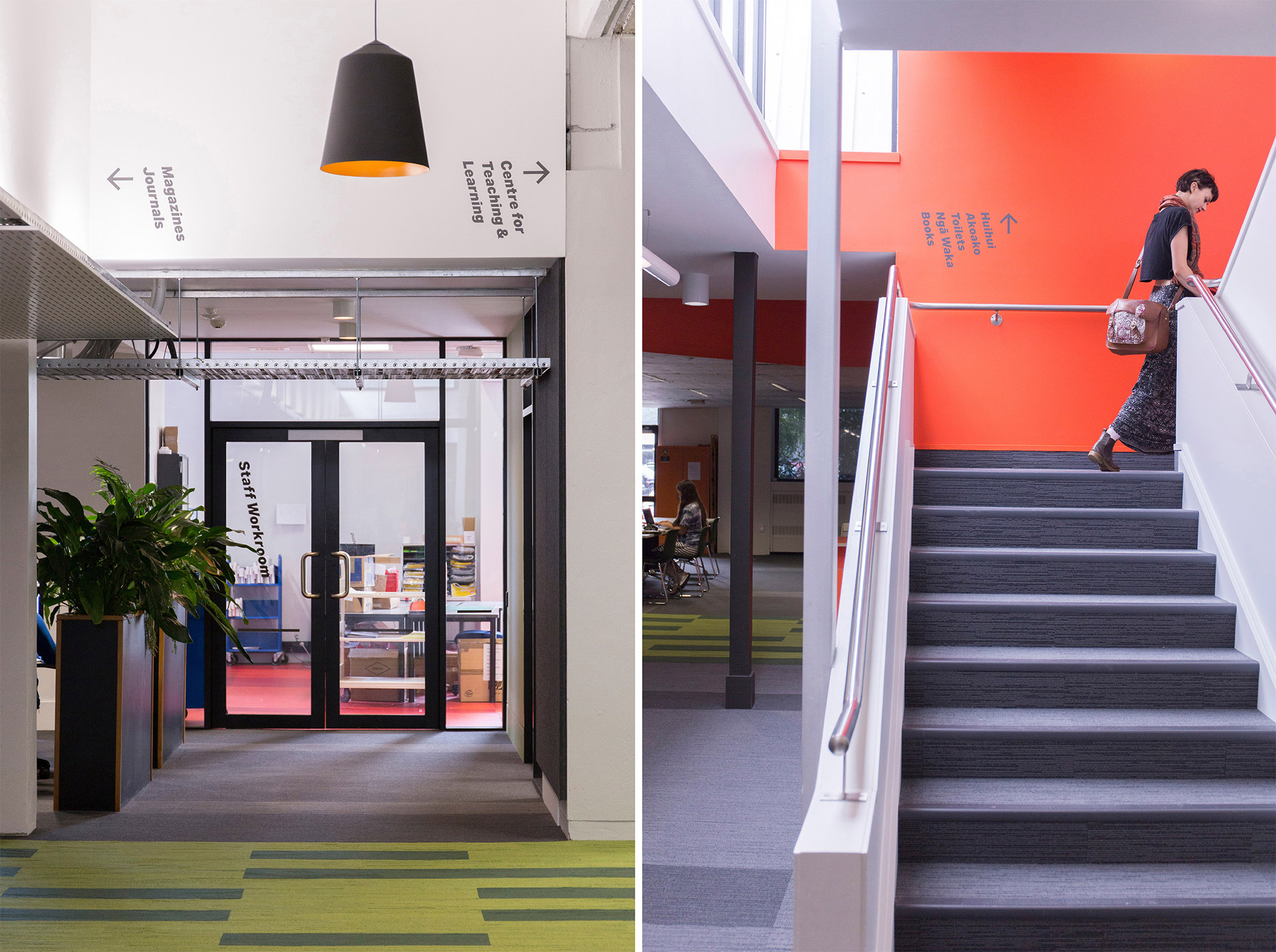
Floor to ceiling graphics and a minimal, flexible wayfinding system has helped position the library as the hub of the Wellington campus. Macro and micro levels of wayshowing allow users to navigate the collection while allowing enough flexibility for the system to be rearranged as necessary.
Te reo Maori and English were equally integrated into the solution. English being used for factual information such as toilets and shelf contents while Te Reo Maori gets used as a placemaking component.
Text and photography copyright of Strategy Design & Advertising.


