To most residents of the Pacific Northwest, rivers and waterways are simply part of the fabric of the region—so omnipresent that their value and contributions to the region’s economic framework are often overlooked.
For the United States Army Corps of Engineers, however, water is the lifeblood of its existence and estuaries are at the heart of its studies. This is reflected in the Corps’ new Seattle District headquarters, where Studio SC’s graphics program underscores the focus of the Corps’ work through a series of river-centric environmental graphics and wayfinding signage components.
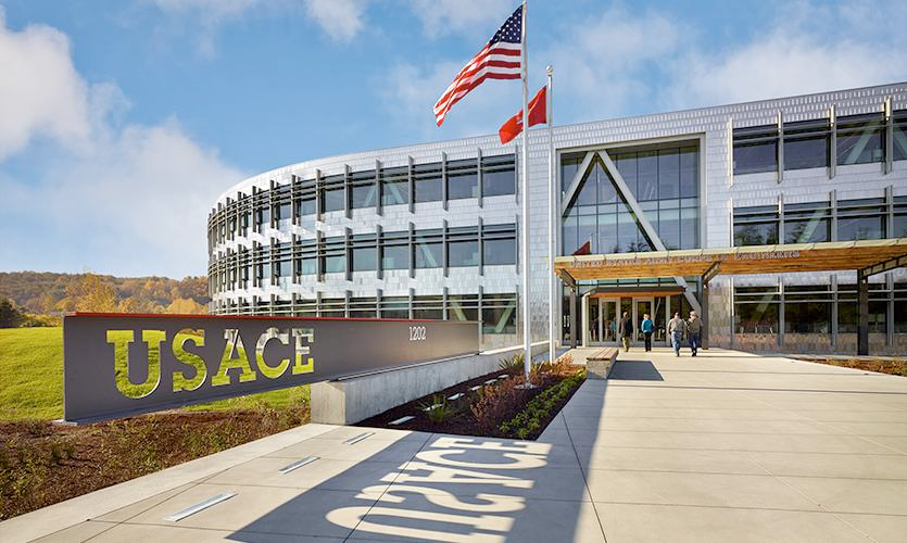
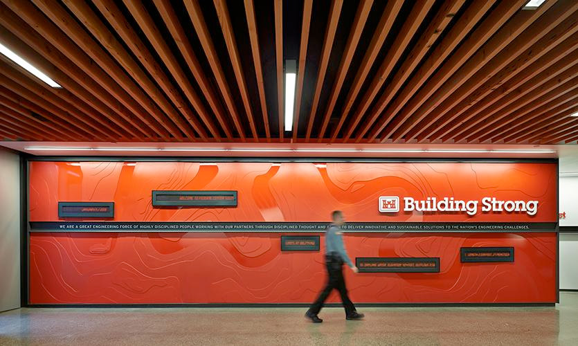
The strength of the organization—and representation of its mantra, “Building Strong”—is embodied in a 30-foot cantilevered I-beam that serves as an identity sign and references the building’s exposed steel diagrid. In the lobby, a USACE-brand red topographic relief of the Duwamish River—on whose banks the Corps’ new headquarters sits—serves as a focal point. The wall includes readerboards with real-time water management data, highlighting the USACE’s work at the intersection of technical data and natural resources.
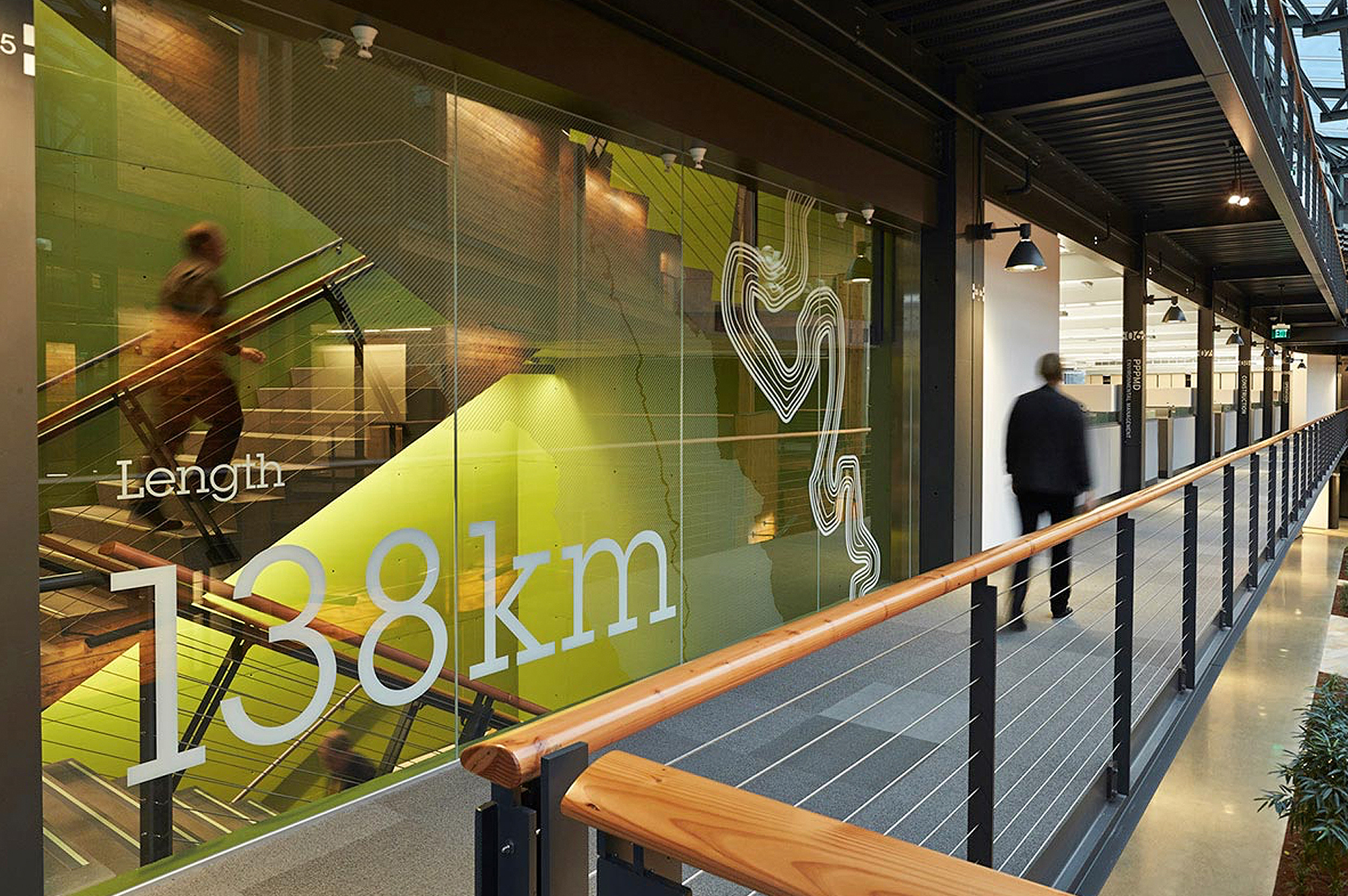
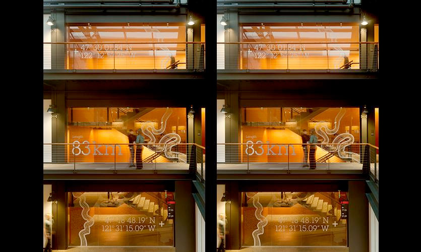
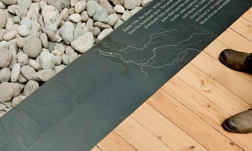
Studio SC’s wayfinding program organizes the building into four quadrants, named after the four parent rivers of the Duwamish. Integral glass graphics spanning three stories showcase technical details about each river, such as coordinates, origin, and length. Seating areas on the first floor of each quadrant feature stories of the namesake rivers’ geologic history and significance sandblasted into stone pavers. Office wayfinding is integrated and flexible, with grid and floor numbers stenciled on the exposed steel columns of the oxbow-shaped building and magnetically attached department signs allowing for easy changeability.
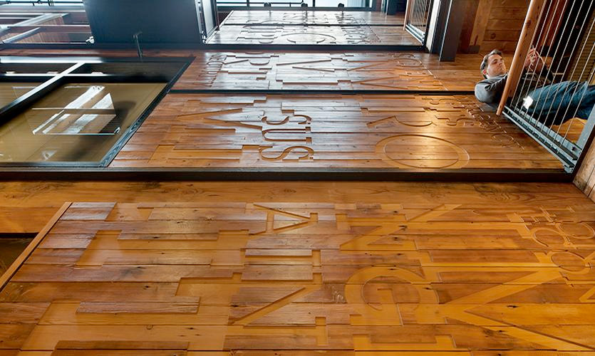
In the cafés overlooking the Duwamish, graphics routed on reclaimed wood chart the river’s historic and current paths, and quotes from historical figures associated with the river provide cultural perspectives. These graphics enhance the gathering spaces and encourage people to engage with the organization’s history and the natural environment just outside the windows. At the heart of the building, a three-story continuous typographic expression of the Corps’ mission and services on the central spine honors the USACE’s unique function at the intersections of the technical and the environmental, of economics and nature, and of history and progress.
CREDITS
Environmental Graphic Design: Studio SC
Architect: ZGF Architects LLP
Photography: Benjamin Benschneider, Lara Swimmer
Text and photography copyright of Studio SC


