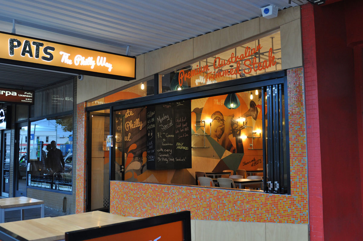
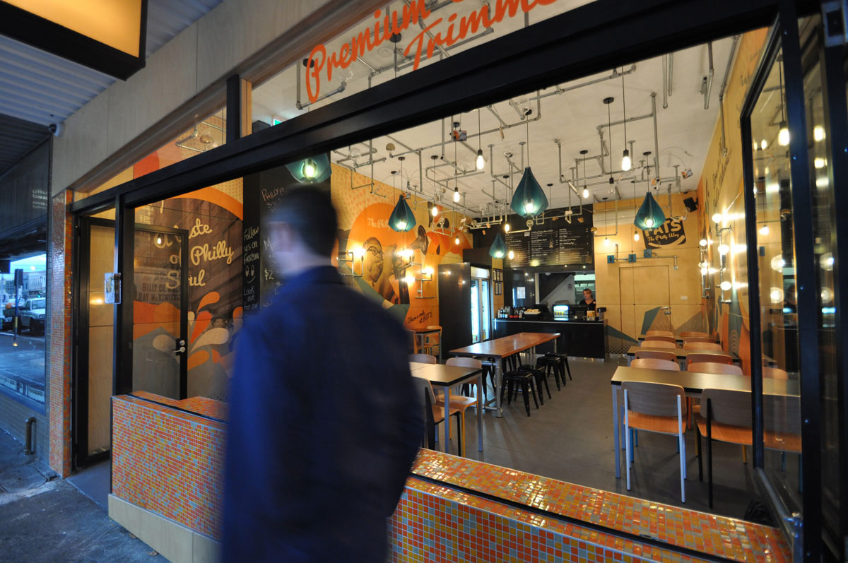
“Philly cheesesteaks” are sandwiches made from thinly sliced pieces of steak and melted cheese in a long roll that originated in and are iconic to the city of Philadelphia in Pennsylvania, USA. The owners of PATS decided to adapt this popular meal to the Australian market and asked Studio Equator to help them create a brand and capture attention for their new business.
They wanted to develop a strong, memorable visual identity and brand that would stand out from the crowd and be instantly recognisable, thus setting up a strong foundation to grow the business.
Studio Equator first suggested and completed a design audit, which looked at the new business’s value proposition and point of difference, objectives, target market, an analysis of competitors, and marketing and brand strategy.
Our recommendation was to develop a brand identity and core message that is artistic, confident, happy and friendly, and to implement distinctly unique differences in their brand to set them apart.
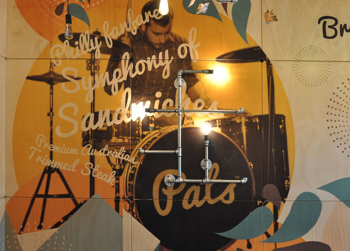
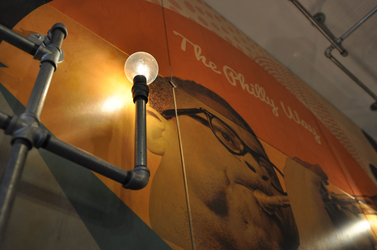
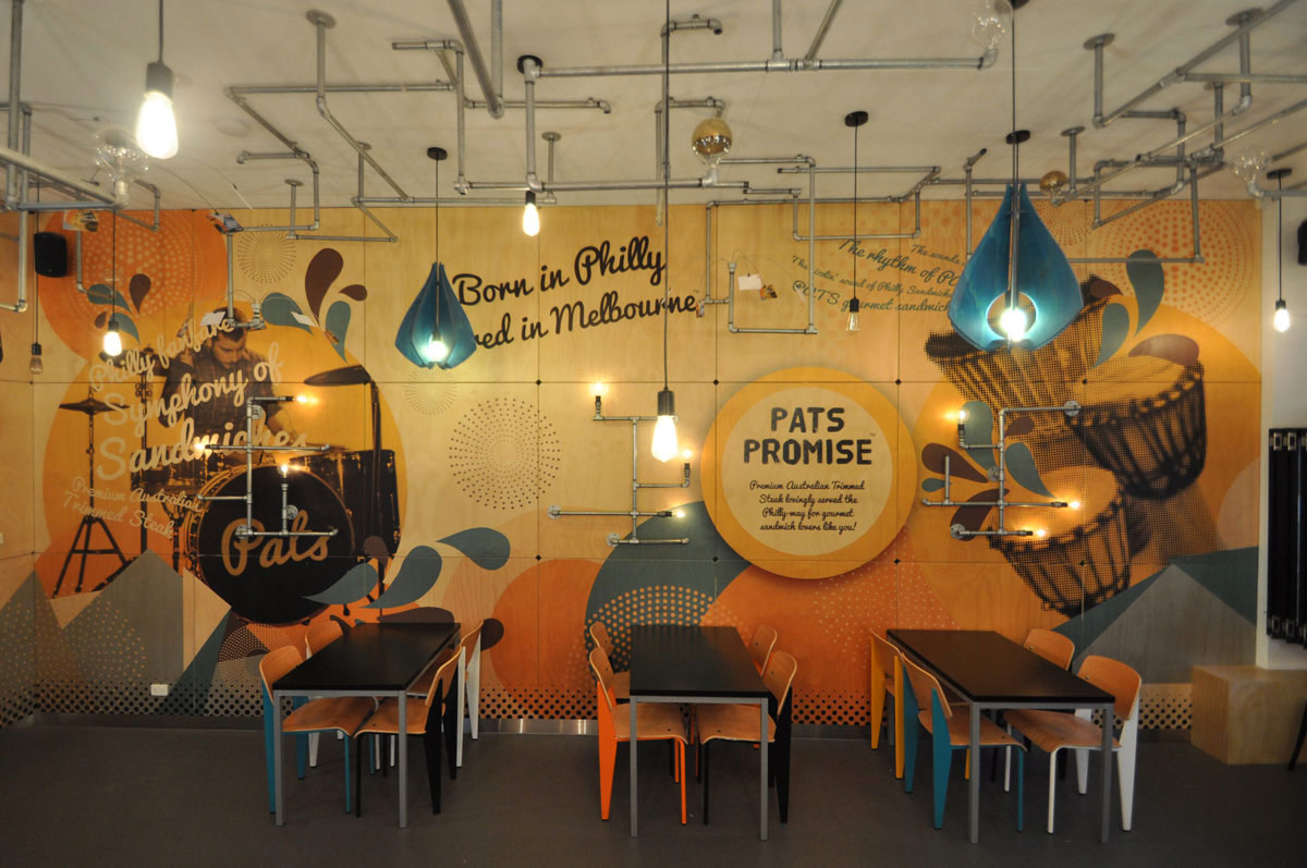
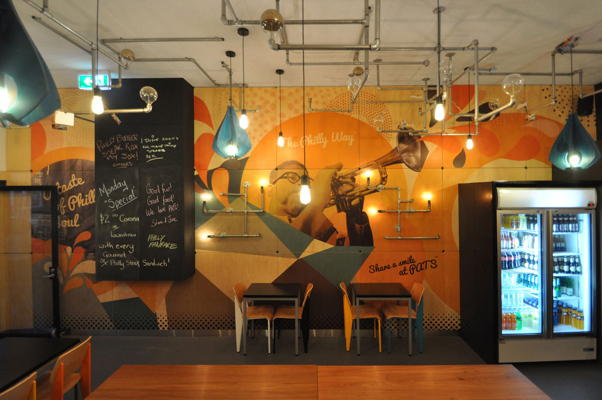
We decided to consciously develop and convey a personality for the brand, and our concept for this was inspired by the city and culture of Philadelphia in the 60’s and 70’s and the great soul, funk and jazz that was prominent at that time. This inspired our chosen colour palette, and the images we developed to create a narrative that tells the Philly story visually.
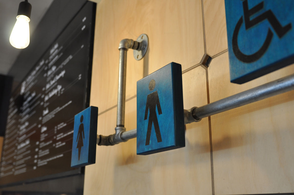
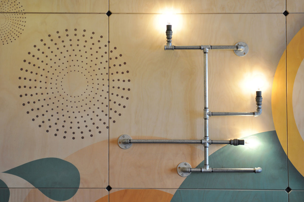
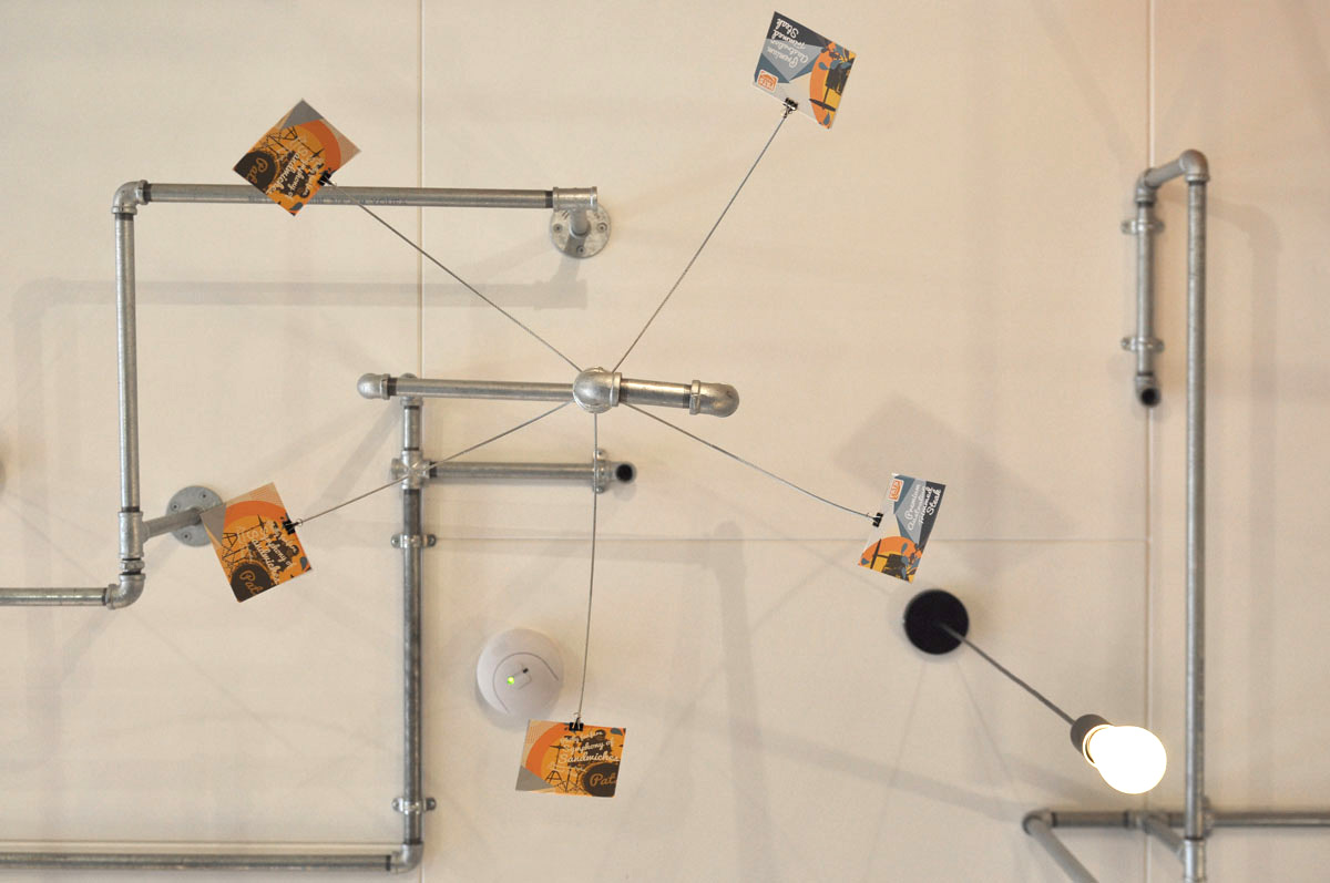
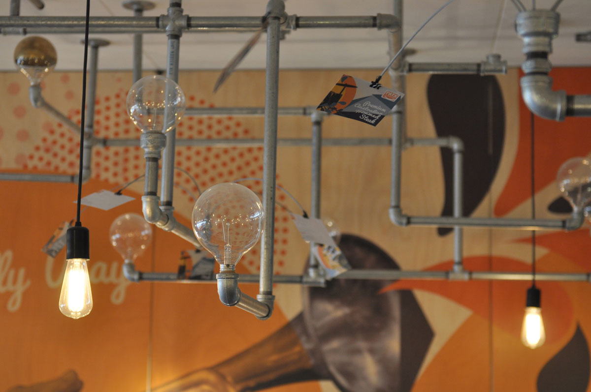
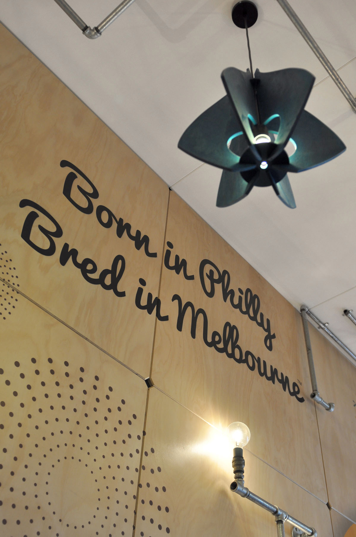
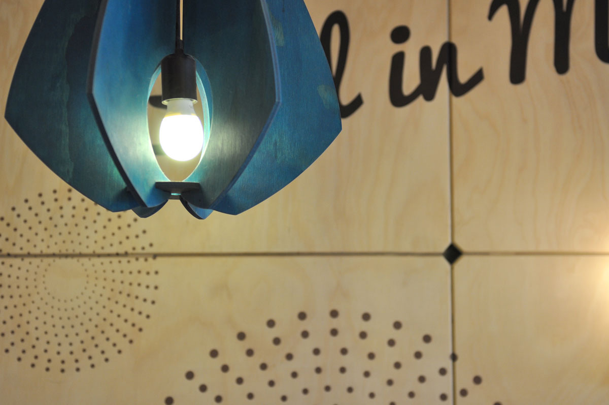
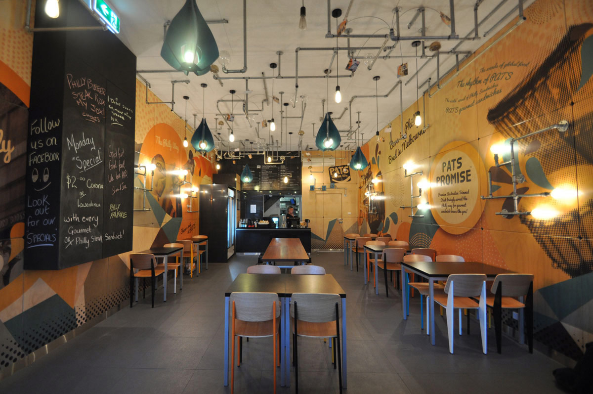
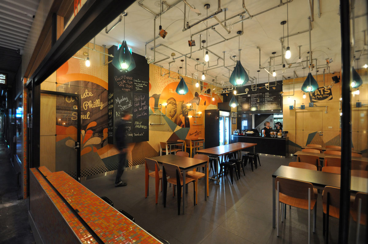
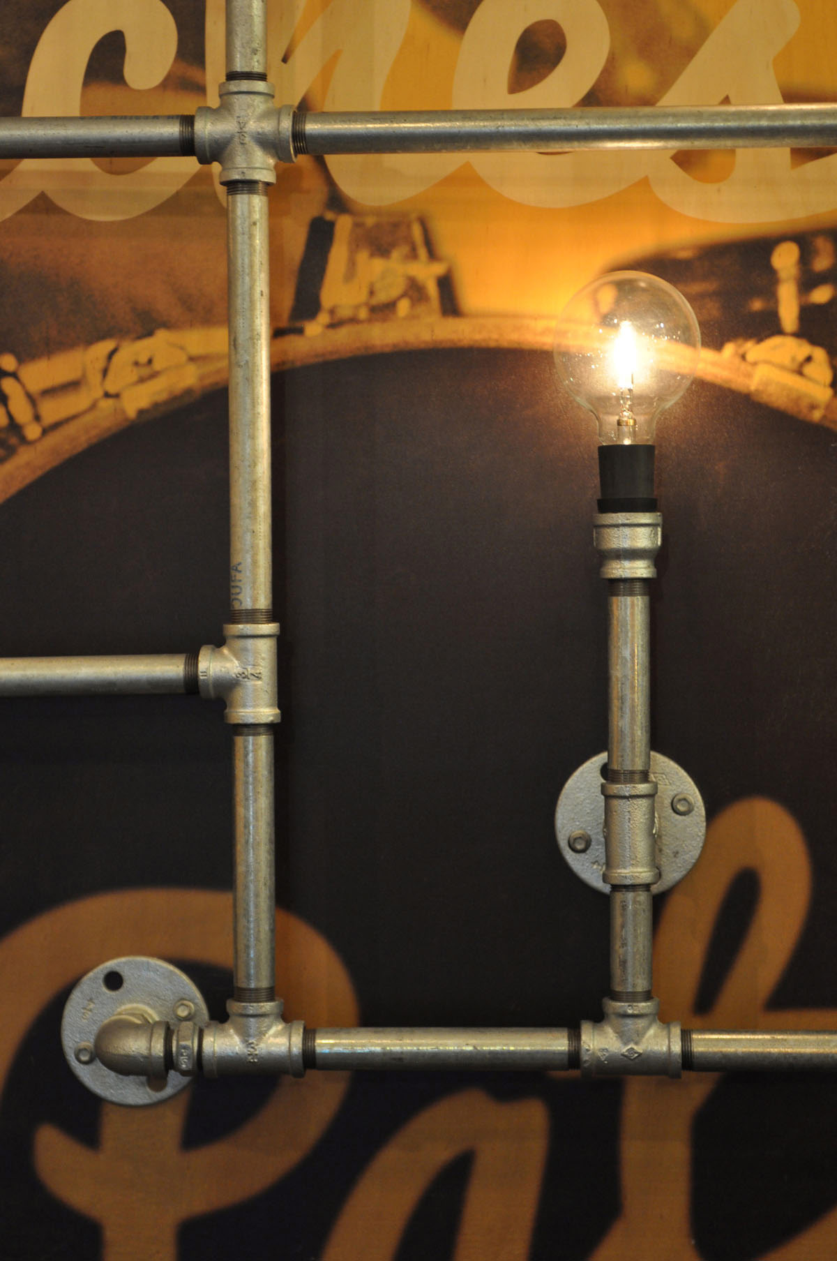
PATS brought a new totally different concept to the Australian market, and to match their unique selling proposition, we suggested the fit out to also be totally new and different. Inspired by the Philadelphian “urban jungle”, we designed a ceiling art installation of plumbing pipes, with naked light bulbs hanging throughout the installation. We also custom designed and made plywood pendant light shades to add interest and contrast.
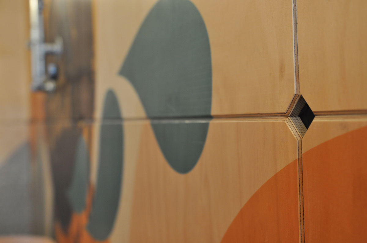
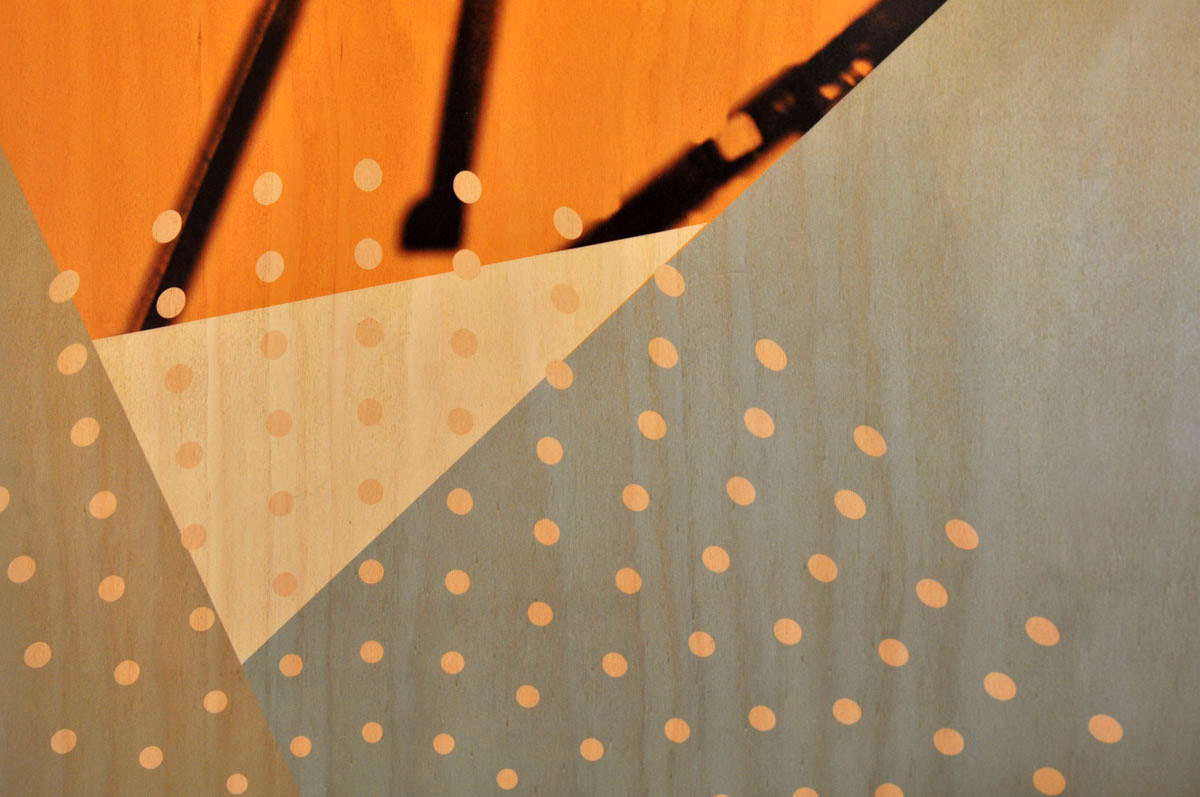
The story-telling graphics we designed, we had printed on plywood panels and attached to the wall as custom wall cladding. This served a double purpose of creating a more moody ambience typical of an underground jazz bar, and adding yet another detail that was totally unique to PATS.
We wanted PATS’ clients to come not just for the food, but for a full experience – to relish the aesthetics, the music, and the ambience just as much as the delicious meals.
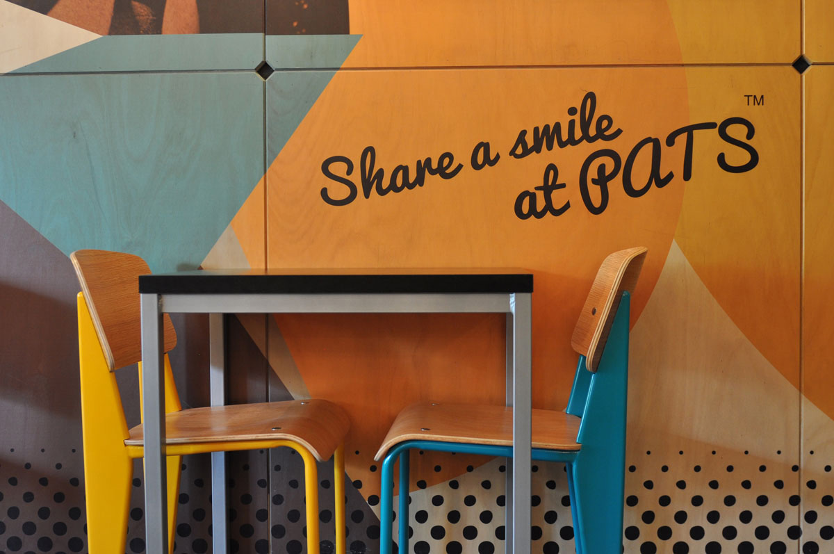
Studio Equator designed the central communal table with legs made from plumbing pipes to match the ceiling installation. The chairs were repainted so each chair is one of four corporate colours, orange, blue, black or white, reinforcing our cohesive, custom design and ensuring a high attention to detail was achieved.
We dreamed of creating an urban Philadelphian inspired fit out that would offer a unique experience to Melbourne diners, and Melbourne diners have not been disappointed!
Text and photography copyright of Studio Equator


