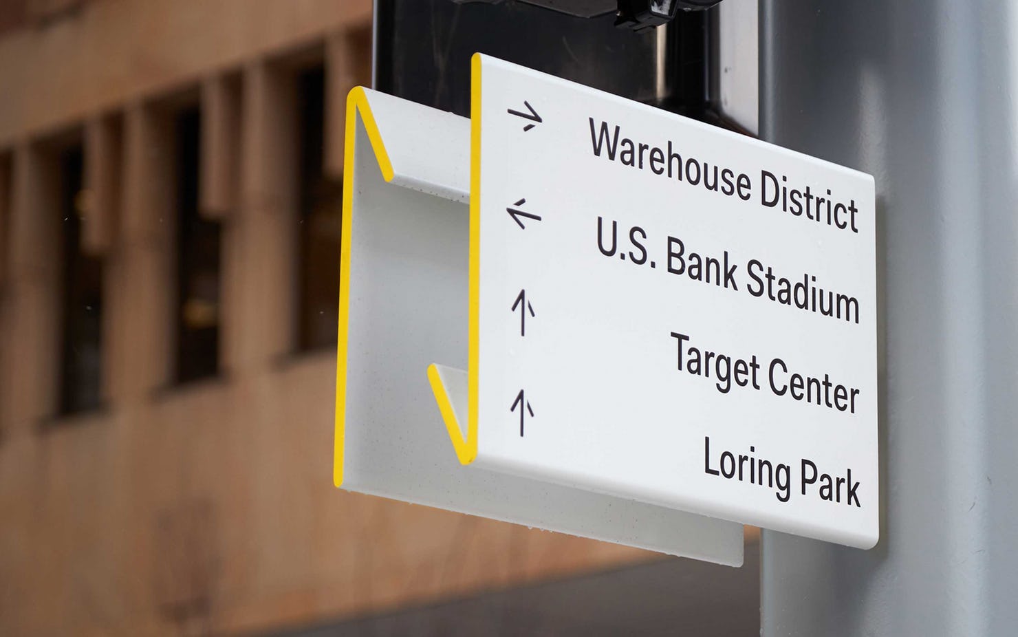
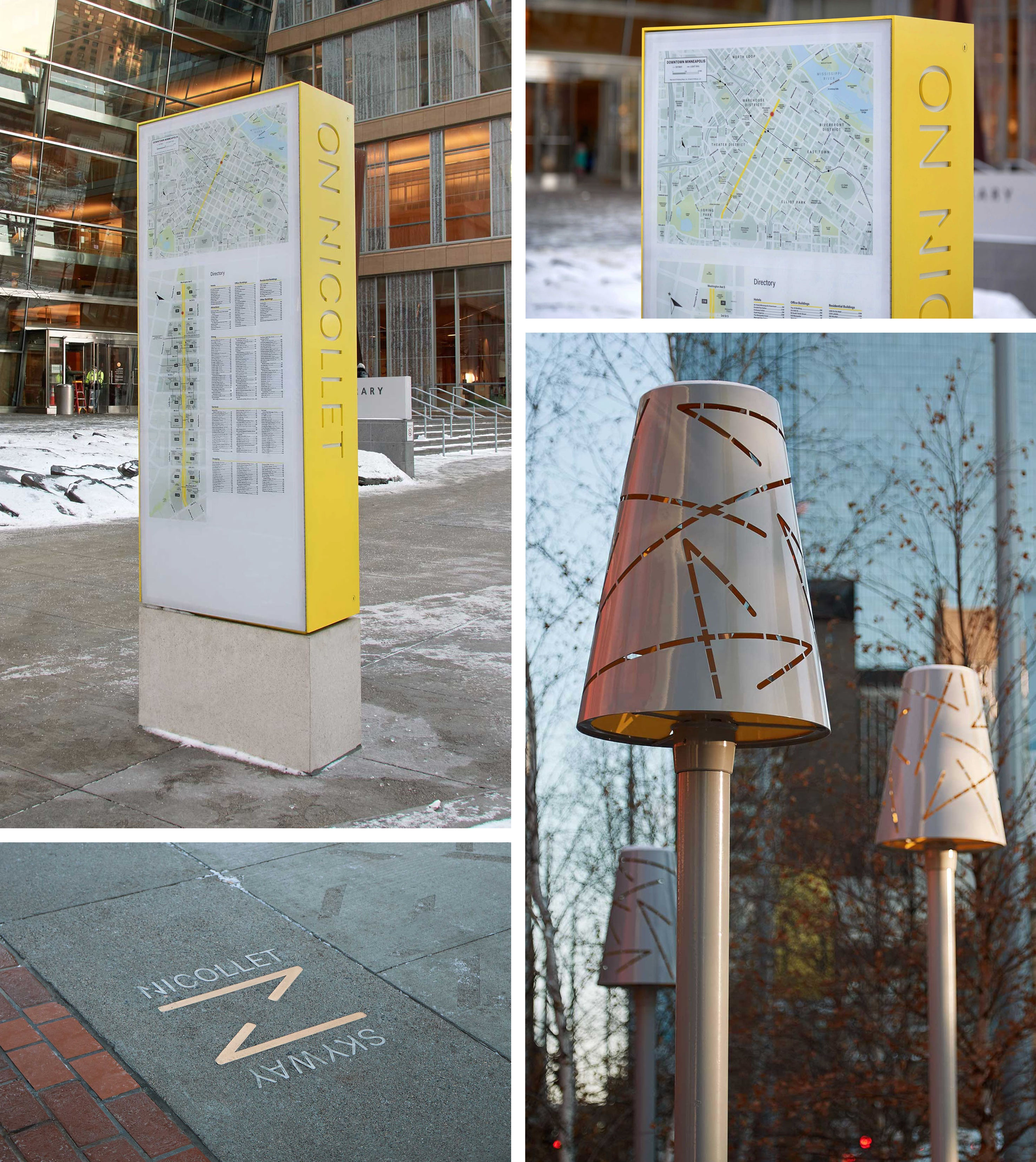
Pentagram is one of my favorite design firms, and I think that they are one of the leading agencies creating signage systems and amazing environmental graphics. They created this identity for the central avenue and destination in downtown Minneapolis, which I think is just beautiful because of its clever simplicity and synthesis.
Check out what the agency has to say about this project:
“Nicollet Avenue is the “Main Street” of downtown Minneapolis, a cultural and commercial center and shopping and dining district that attracts people to work, shop and eat year round. The thoroughfare recently reopened after undergoing a major renovation to make it more pedestrian friendly. As part of the revitalization, Pentagram has designed a brand identity and comprehensive program of signage, wayfinding and environmental graphics for Nicollet that capture the spirit of the street and its place in the city.
Pentagram worked closely with James Corner Field Operations, the renovation architects, the Mpls Downtown Improvement District and the City of Minneapolis on the project. The area is known as Nicollet Mall, but the city wanted to move away from “mall” because it is too limiting and implies the street is a shopping mall. While there are stores and restaurants on Nicollet, it is much bigger than the sum of its parts, a vital thoroughfare and integral part of the city that helps define the character of downtown and offers many visitors their first impression of Minneapolis. The brand messaging captures all this in a simple tagline, “On Nicollet,” that highlights the avenue as a destination.
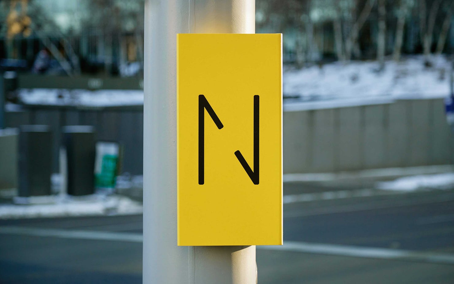
The identity centers on a letter “N” built from two sides of a directional arrow, one going up and one going down, conveying the movement of traffic along the street.
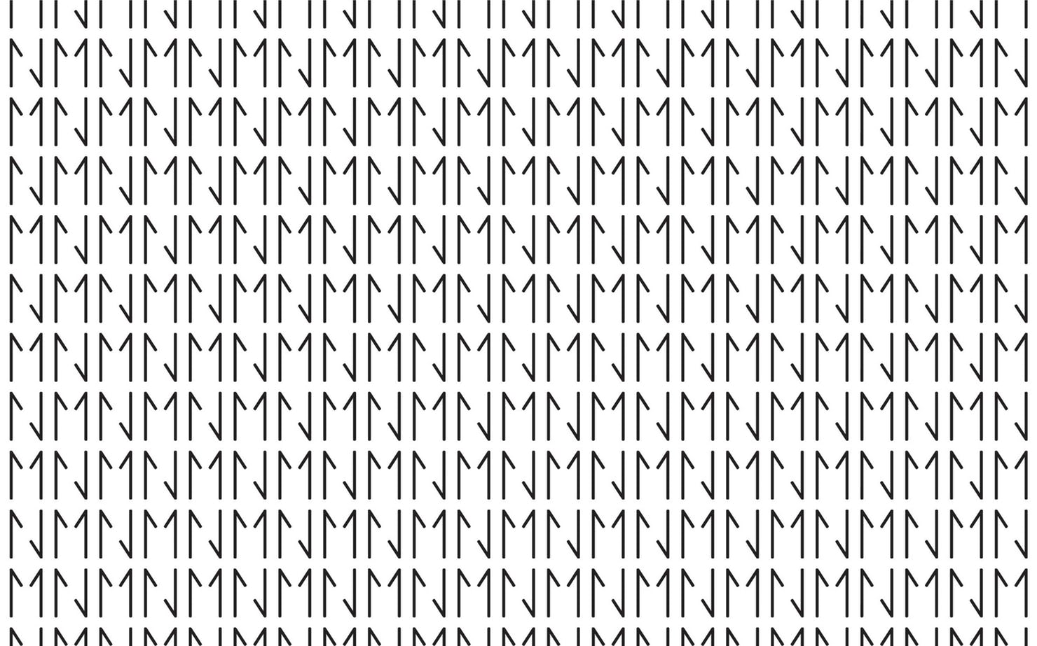
The identity centers on a letter “N” built from two sides of a directional arrow, one going up and one going down, conveying the movement of traffic and arterial role of Nicollet. The arrow forms can also be used to construct a letter “M,” for the “MN” Minnesota state abbreviation, or “NM” for Nicollet Mall. Typography is set in the highly legible sans serif Fakt, and the traffic-oriented color palette features a bright, eye-catching yellow, along with black and white.
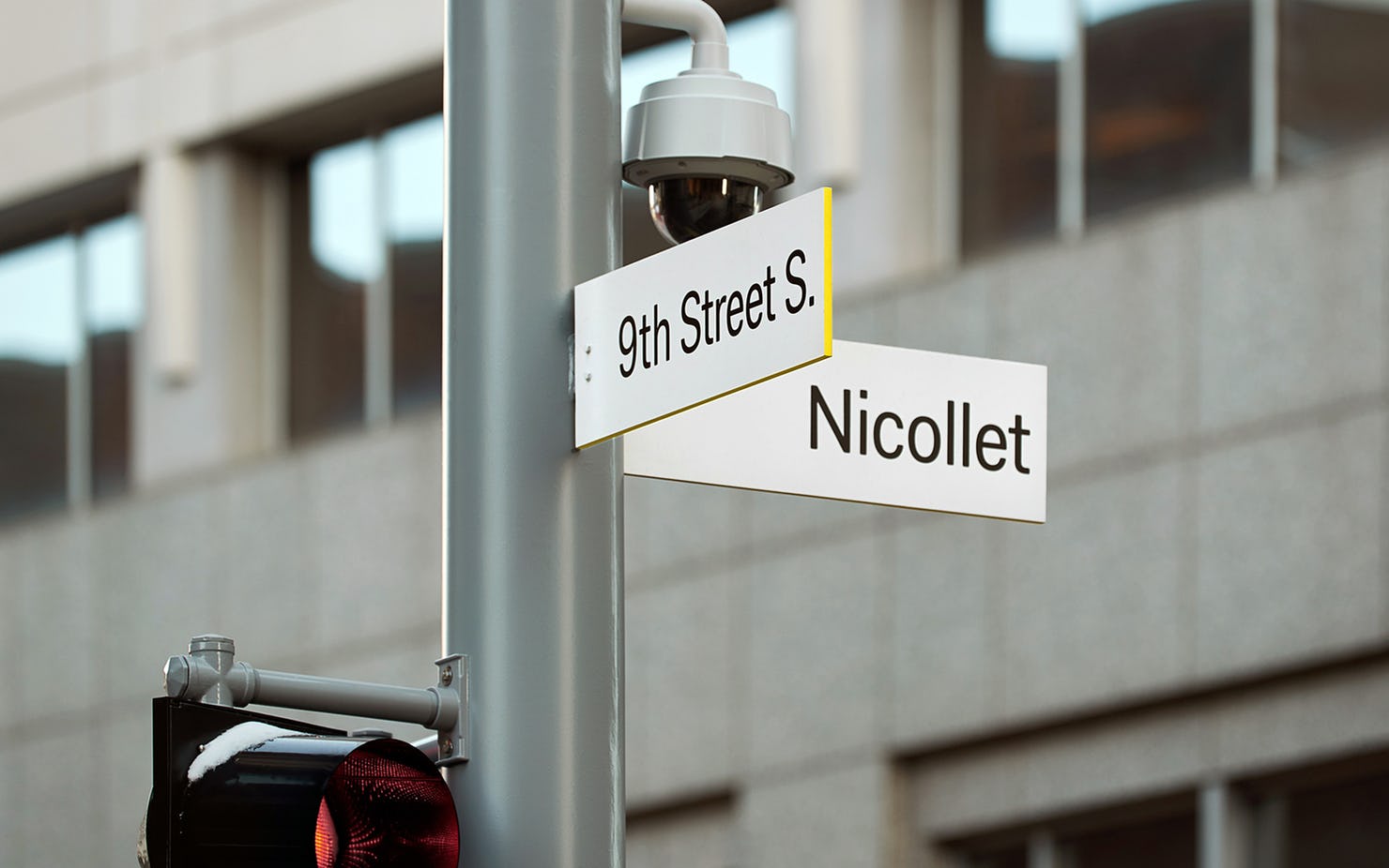
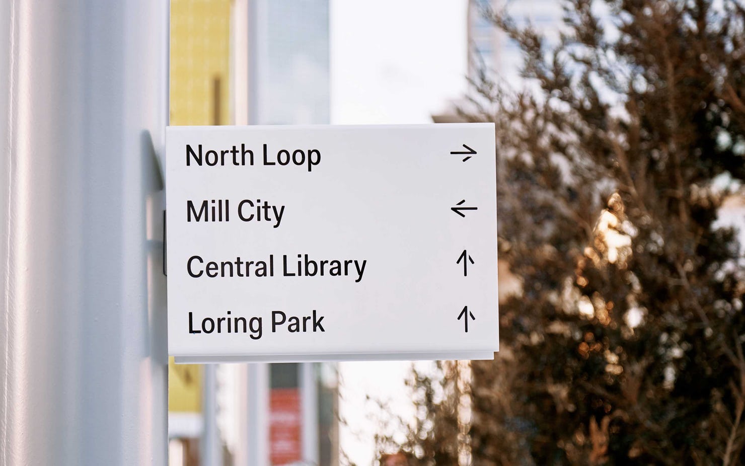
The directional elements of the Nicollet branding extend to a comprehensive program of signage and environmental graphics for the street, including directories, kiosks, banners and street signs. The fold of the logo provides the form for dimensional signage affixed to poles and street lights. Other wayfinding is inset in the pavement, where the arrows provide direction, and they can also be used as a graphic pattern, as seen on heat lamps along the avenue.”
Photography and text are copyright of Pentagram


