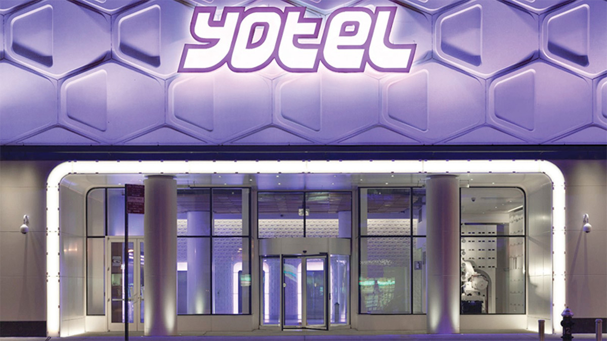
GBH has been working with the Yotel capsule hotel brand for the last 12 months, helping redefine its proposition, identity and environmental graphics ready for its expansion outside of Europe.
Yotel was originally the brain child of Simon Woodruff, founder of Yo-Sushi and was positioned as part of the ‘Yo’ brand. As such, it’s original identity reflected the futuristic, japanese influence of the sushi restaurants, but featured a cube icon to represent the compactness of the hotel rooms.Initially the hotels were located only at airports and offered a mix of innovation and utility wrapped in a futuristic style.
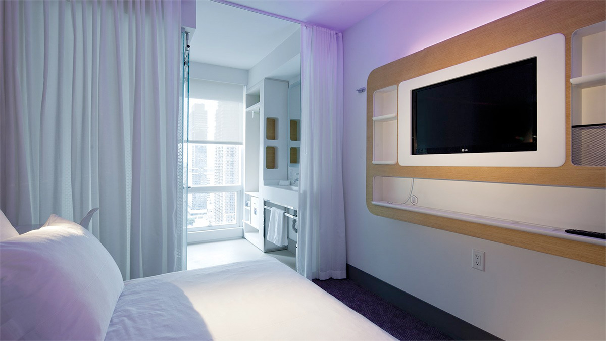
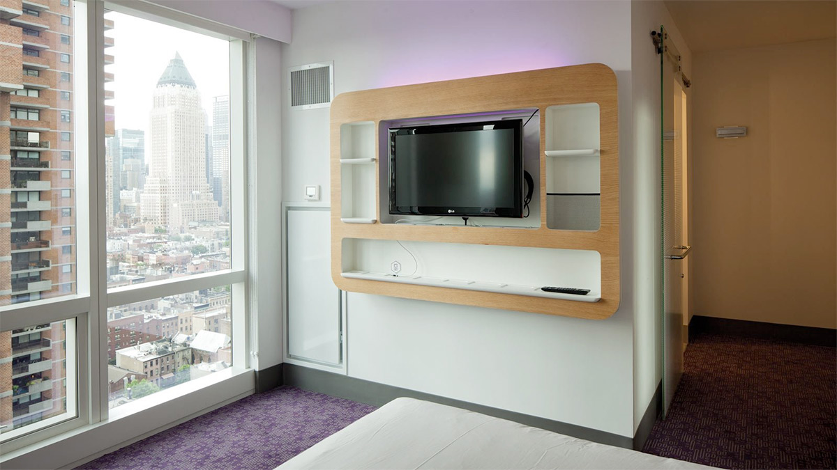
From the start we saw the opportunity to build on the original values and personality. It was time for the capsule story to evolve to accommodate the upgrade in the offer without losing the core concept of innovative use of space with a futuristic, japanese aesthetic. The first step was to rationalize the existing identity and create a full set of guides for use by marketing teams as well as hotel staff. The cube was removed from the logo to move focus away from ‘capsules’ but importantly the phrase ‘smartspace’ was introduced into the Yotel vocabulary as a way of communicating the innovative functions and features that each room comes with, such as space saving fold-away beds and clever storage areas.
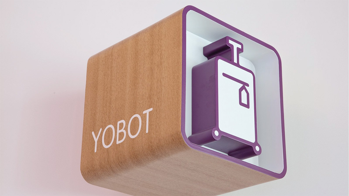
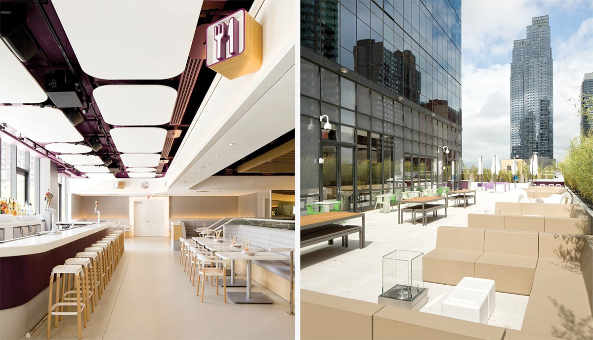
Once inside the lobby though, it’s the Yobot, a fully working robot which takes, handles and stores luggage, that steals the show. With such a large space to be filled, there was a wonderful opportunity for drama and the yobot makes no mistake in communicating the modernity, innovation and style of the brand. Inside the hotel itself we identified the areas and touch points of the environment that we felt could best communicate the brand personality and allow us to treat mandatory information in a fresh way.
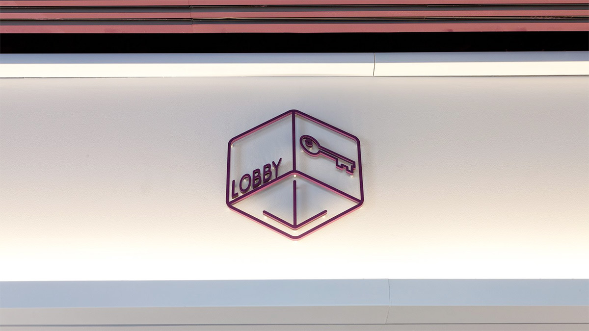
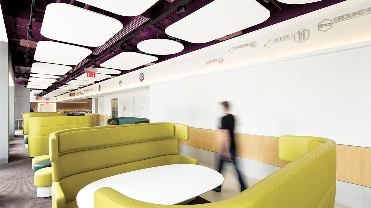
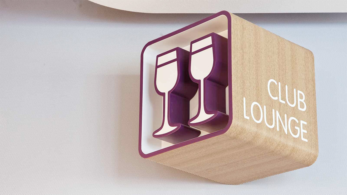
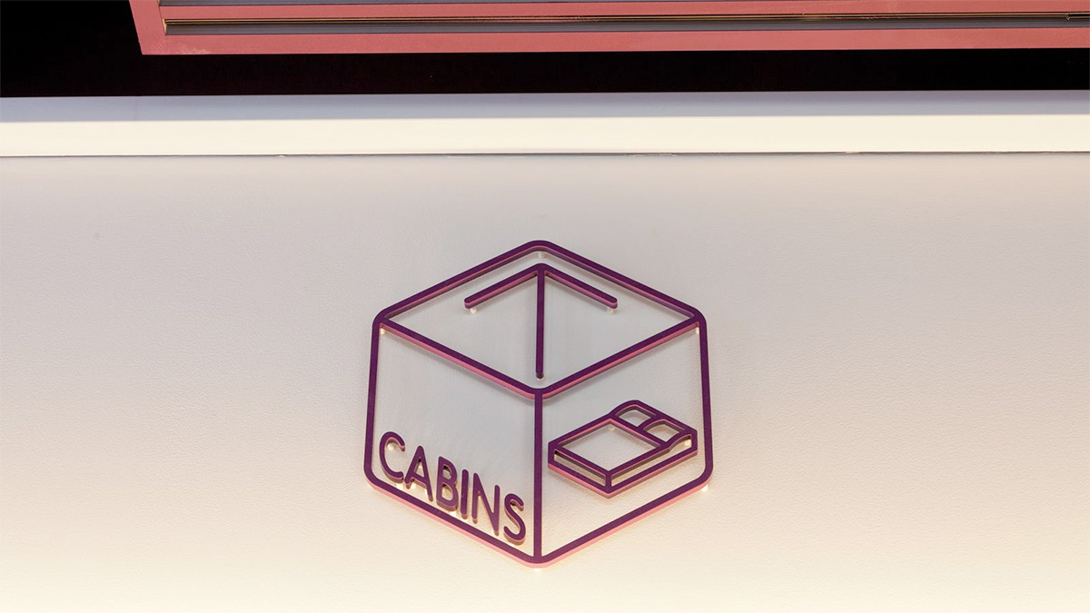
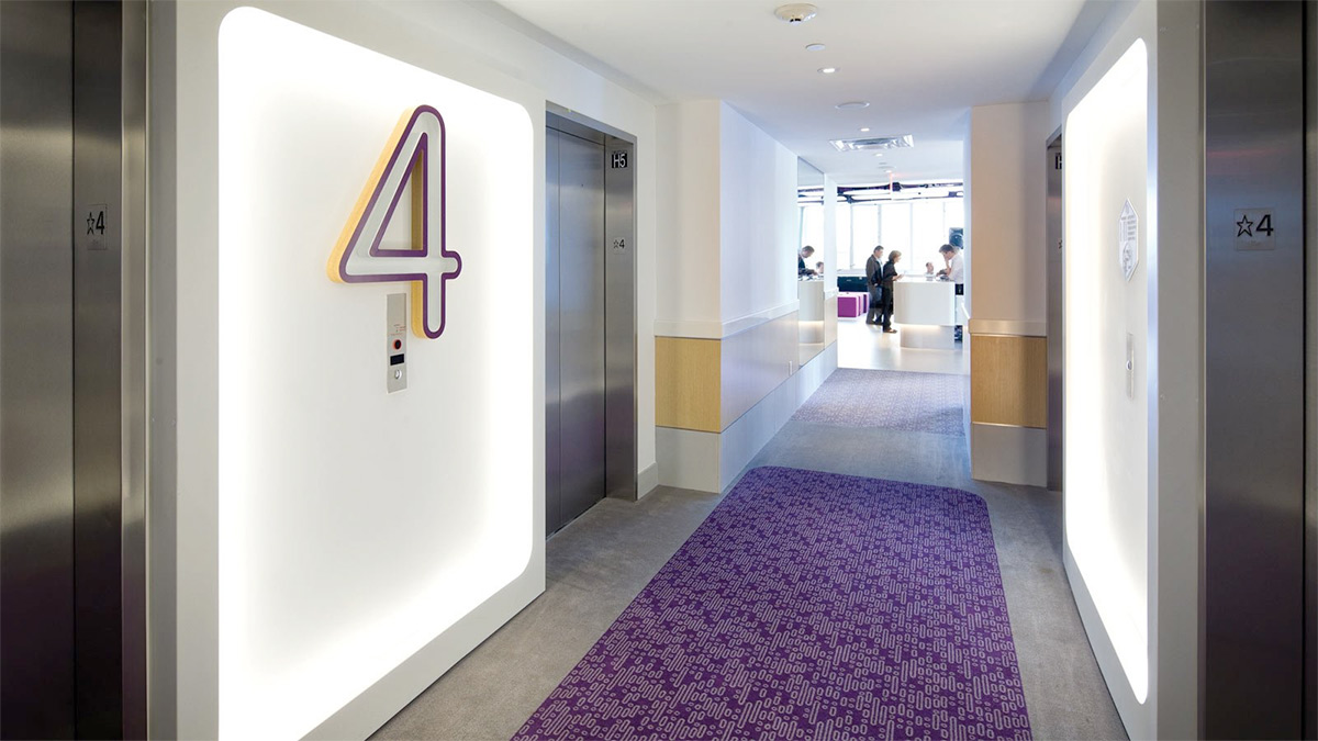
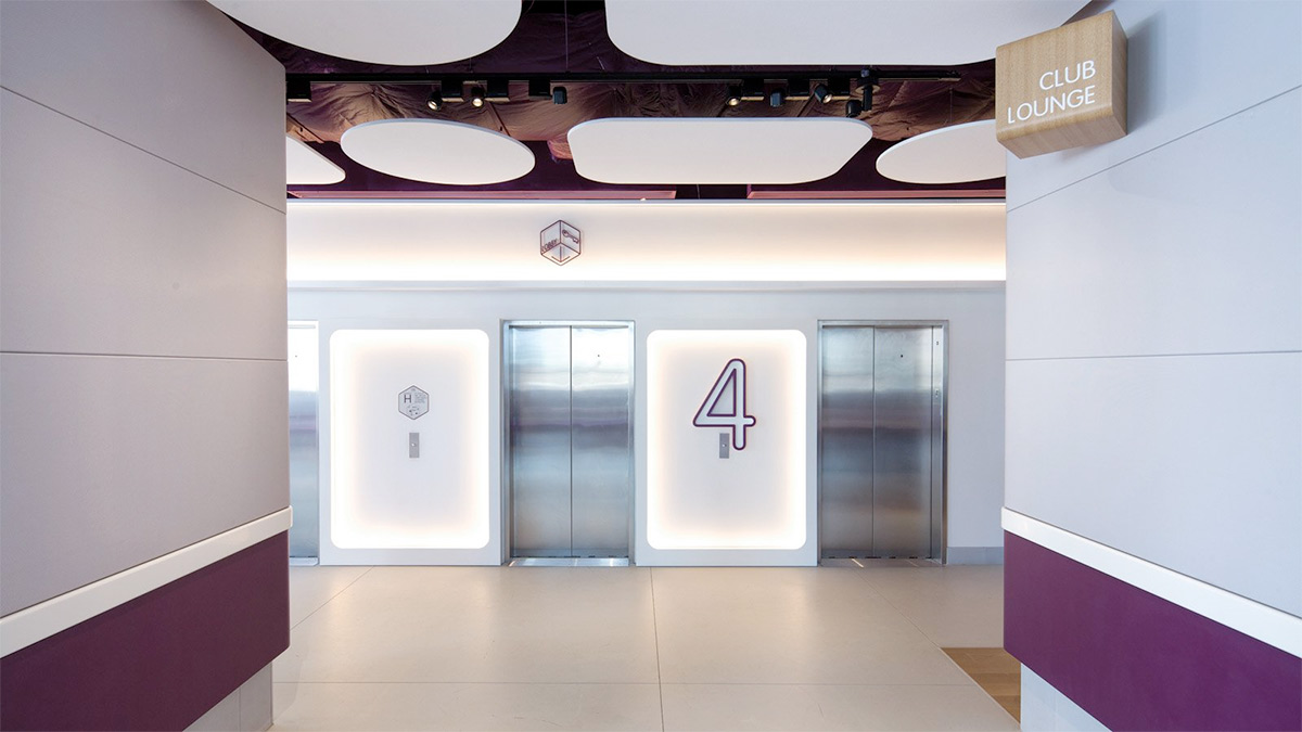
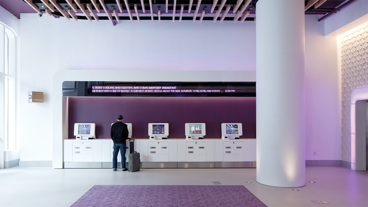
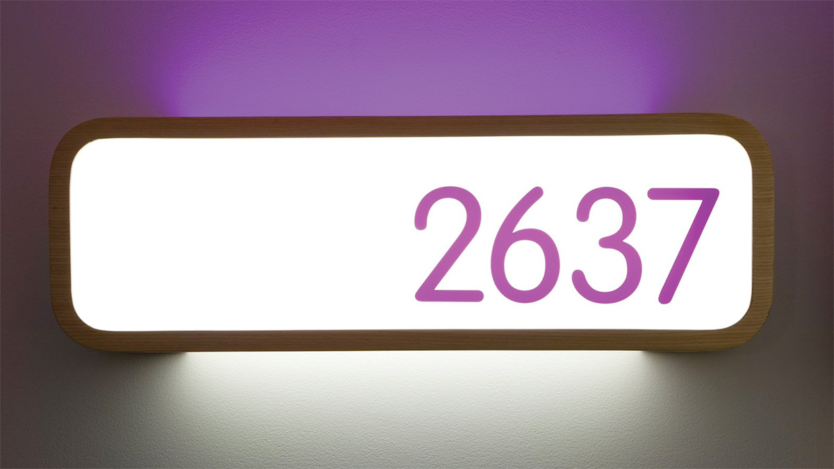
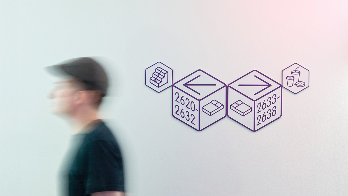
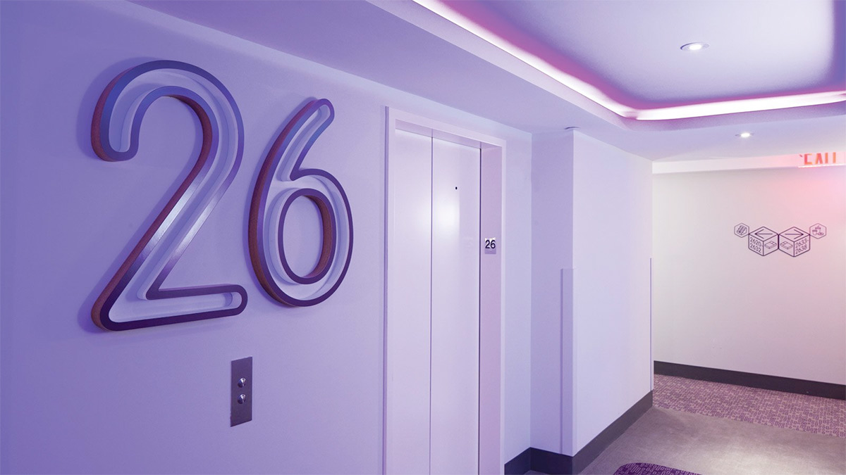
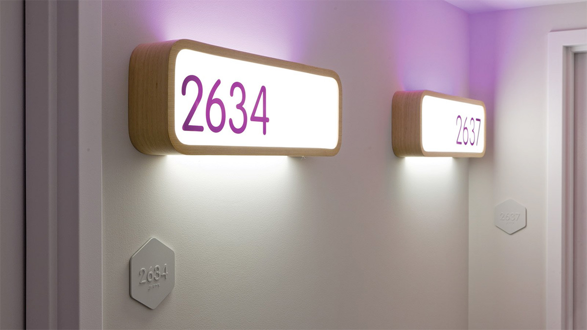
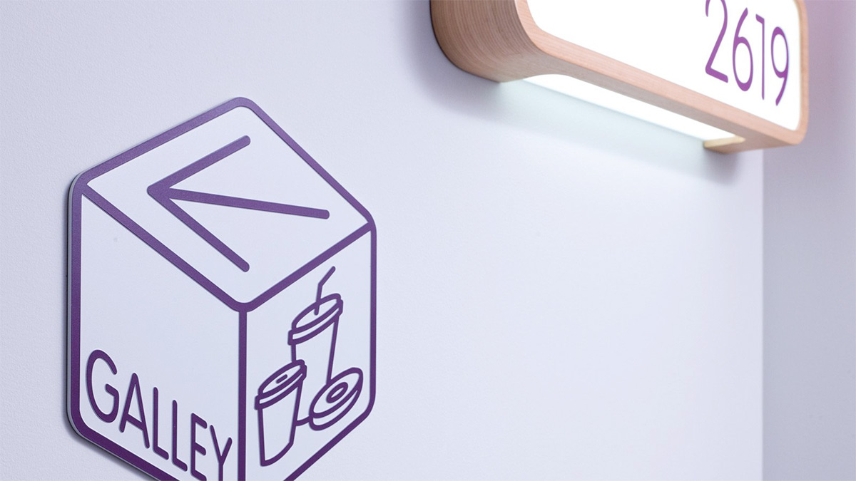
Design work included signage (over 1200 in all), in-room items, staff uniforms and communal area graphics. Many services which are normally staffed in a hotel are self-service at Yotel; automated check-in/out, a galley kitchen and ‘take-out’ restaurant and provided perfect opportunities to marry a futuristic form with operational functionality. The cube icon from the original logo was re-instated within 3D signage (a subtle reminder of the room aesthetic) while graphics were kept to a minimum and echo the clean, futuristic lines and modern materials of the interiors. Meanwhile this influence even extended to language, with the naming of the 24-hour concierge desk as ‘Mission Control’ and the rooms as ‘Cabins’.
Text and photography copyright of GBH


